A new way of measuring urban density that explicitly considers walkability
by DW Rowlands
Editor’s Note: We’re pleased to offer this guest commentary by DW Rowlands. DW Rowlands is a human geography grad student at the University of Maryland, Baltimore County. Her current research focuses on characterizing neighborhoods based on their amenability to public transit and on the relationship between race and the distribution of grocery stores in the DC area. She also writes on DC transportation, history, and demographic issues for Greater Greater Washington and the DC Policy Center. Follow DW on twitter at @82_Streetcar or contact her by email at d.w.rowlands<at>gmail.com.
Conventional density measures versus walkable density measures
Density is one of the most fundamental properties of urban areas: what makes a city different from a suburb, and suburbs different from rural areas is chiefly how many people there are, and how close they are to each other. The fact that people in cities live and work near each other is both economically important—it makes it easier for specialized jobs and workers and stores and customers to find each other—and culturally important—it exposes people to those different from them while also making it easier to find others who share their interests, needs, and cultural traditions.
Maps of Walkable Density vs. Ideal Density for US Metro Areas
Density is also very important for transportation. Most people are unwilling to walk much more than half a mile on a regular basis, which means that destinations—jobs, stores, transit stops, and so on—are only within “walking distance” of people within a half mile of them. However, while it’s common to calculate the density of a city, or a metro area, by dividing the total population by the total area, this method isn’t always informative. If 80% of the people in a city live in 20% of the city’s area, then the average person is experiencing much higher population density than this average value would suggest.
A more-useful way to measure the density that people actually experience is to calculate the “population-weighted average” of population density. The population density of each Census tract or block group is calculated individually, and the densities are averaged together, weighted by their population. A population-weighted average shows the level of density experienced by the typical resident in his or her census tract. This means that the densities of block groups with more residents have a bigger influence on the overall value.
This measure has limitations as well. A particularly significant one is the fact that not everywhere within a certain straight-line distance of a location can be reached by walking that distance: in cities, pedestrians are generally limited to following the street network. In a city with a traditional street grid, this doesn’t make that big a difference, though it means you have to walk further to get somewhere diagonal to the street grid than somewhere you can get to by following a single street.
Most neighborhoods in American metro areas don’t have ideal street grids, however: winding roads and cul-de-sacs force pedestrians to take indirect trips, and bodies of water, hills, freeways, industrial areas, and superblocks often pose barriers. This reduces the number of destinations that can be reached by walking a given distance. To take this into account, I’ve developed a statistic called “Percent Ideal Walkshed” to measure the fraction of locations within a half mile of the center a block group that are actually within a half-mile walk of it.
Calculating percent ideal walkshed as measure of walkable density
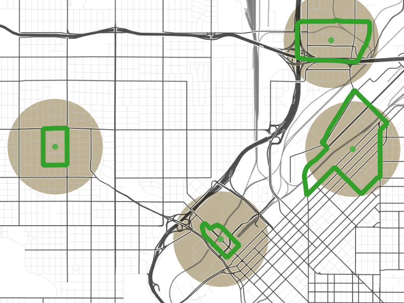
To calculate percent ideal walkshed, I began by finding the center of every Census block group in a metropolitan area. (Here, I’ve selected four block groups in downtown Denver, outlined in green, to use as examples.) If the street grid didn’t constrain where one could walk, everywhere in the beige half-mile-radius circles would be within a half-mile walk of the centers of the block groups.
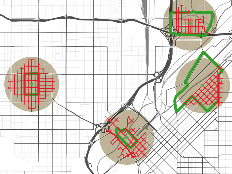
However, since pedestrians can’t fly, they do have to walk along the street grid. The streets within a half-mile walk of the centers of the block groups are highlighted in red. In an area with a good street grid, like the left-most block group, this “walkshed” forms a diamond shape with its tips nearly at the edge of the half-mile circle. If the street grid is broken up by freeways, railroad tracks, or other obstacles, though, the walkshed may cover much less of the circle.
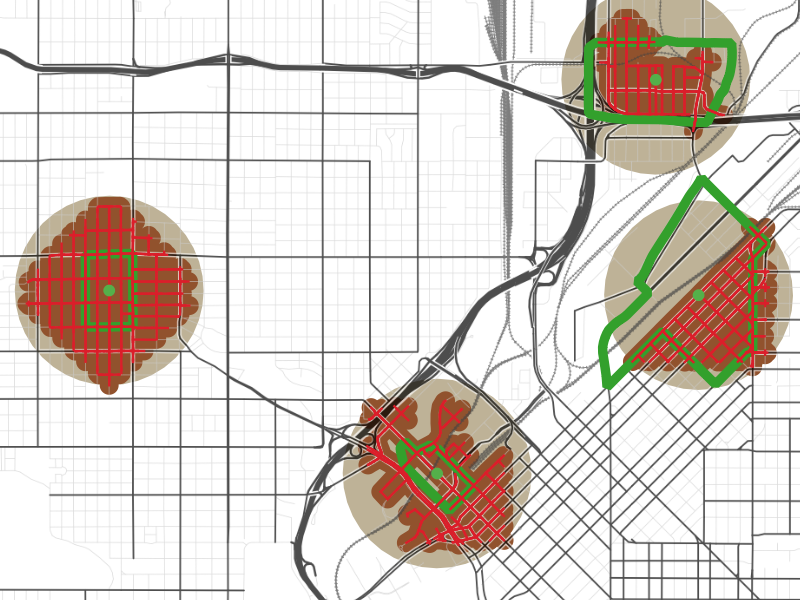
I then created buffers around these streets to convert the one-dimensional walkshed of streets into a two-dimensional area—here shown in brown—that is a half-mile walk from the center of the block group. The better-connected the street grid is in the region around a block group, the closer the area of this brown buffer will be to that of the beige half-mile circle.
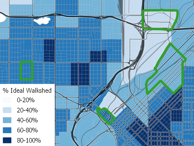
Finally, I color-coded each block group by the ratio of the area of the brown walkshed buffer to the area of the beige half-mile circle. I call this value “Percent Ideal Walkshed,” because it measures the fraction of area within a half mile of the center of the block group—the ideal walkshed—that is within the true walkshed of the center of the block group.
When this analysis is performed over the whole metropolitan area, it shows that the areas with the most-ideal walksheds are mostly concentrated in the core—which one would expect to be densest—but that clusters with high percent ideal walkshed values are found elsewhere, too, indicating suburban areas with good, well-connected local street grids. We’ve mapped walkable density in 17 of the nation’s largest metropolitan areas; you can see those maps here.
One very consistent pattern in these maps is that urban cores have much higher values of percent ideal walkshed than their suburbs do. This means that core areas—which tend to be the densest parts of a metro area—have walkable densities closer to their conventionally-measured densities than suburbs do: conventional density measures understate the walkable density of urban areas relative to suburban areas.
Metro areas ranked by walkable density
Maps of percent ideal walkshed give a convenient way to tell how much the structure of the street network reduces effective “lived” density on a local scale. However, they don’t give a very useful sense of how good or bad the street network in a metropolitan area overall is. In calculating an average value of percent ideal walkshed, we run into the same issue we saw with average population density: what really matters is the quality of the walkshed of where the average person lives.
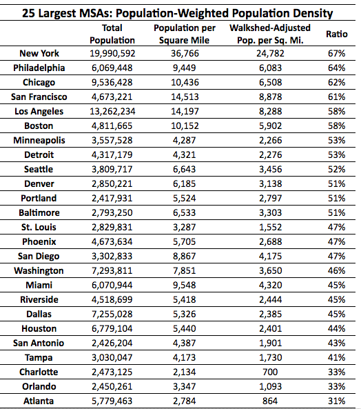
To determine the quality of the walkshed experienced by the average resident, I calculated the population-weighted average population densities—the average population densities of block groups, weighted by the populations of the block group—and walkshed-adjusted population-weighted average population densities—the same calculation, but with each block group’s density multiplied by its percent ideal walkshed—for each of the 25 largest metropolitan statistical areas (MSAs) in the United States.
In addition to the population weighted figures, I performed the same calculations with job-weighted job density, finding the connectedness of the street network where the average job in a metro area is located. Unsurprisingly, since jobs tend to be more concentrated in downtowns with good street grids than population is, these values are generally higher than the population-weighted figures.The ratio of the walkshed-adjusted to non-walkshed-adjusted density for a metro area is equivalent to the population-weighted average of the percent ideal walkshed for the metro area. Unsurprisingly, the metro areas with the highest ratios are New York, Philadelphia, Chicago, and San Francisco: all cities with dense urban cores with good grid networks. Next on the list are less-dense metro areas in the Midwest and West that have regular grid networks that extend even into their low-density suburbs, as well as Boston, which has a dense urban core that has a well-connect, but non-grid, street network. The cities that do the worst by this measure—Charlotte, Orlando, and Atlanta—are all low-density cities in the Southeast that lack significant street grid networks.
The pattern here is fairly similar, but there are some differences. Washington does significantly better in the job-weighted rankings, presumably because its urban core, where most jobs are, has a regular grid, while most of the MSA’s residents live in post-World War II suburbs with much less well-connected street grids. (Unlike other major Northeastern and Midwestern cities, most of the Washington MSA’s population growth has happened in the automobile era, due to the expansion of the Federal government during the New Deal and World War II.)
Notably, only two metro areas have worse-connected street grids where the average job is located than where the average resident is located: Detroit and Riverside. In Detroit, this is likely because the urban core, which has a regular street grid, has lost the vast majority of its jobs, while employment is decentralized to suburban locations. While the urban core has also lost significant population, its job loss has been worse, and many of the residential suburban areas still have regular street grids.
In Riverside, the effect is more likely related to the fact that the Riverside MSA is, to a significant degree, a suburb of the Los Angeles MSA. Jobs in the Riverside metro area has a disproportionately large, low density distribution industry and a large share of retail and other jobs that serve residents, which are more likely to be found in car-oriented suburban areas with disconnected street grids (for example, near freeway interchanges) than jobs in metro areas that have strong downtown commercial cores.
Both the population and the job density data tell roughly the same story, however. Just as conventional density measures understate the walkable density of urban cores compared to suburbs, they understate the walkable density of older traditional metro areas compared to newer sunbelt ones.
Appendix: Technical Notes
Walksheds were calculated with the “service area” tool in QGIS 3; all other data processing was done in R, primarily using the sf package for data analysis and the tigris, tidycensus, and lehdr packages to download data. All calculations were done using the local state plane that contained the metro area (or the CBD of the metro area, for metro areas that extend across state plane boundaries) as calculations in a US-wide planar projection caused too much distortion to get accurate and consistent area values.
Walksheds were calculated from the point on the street network nearest to the centroid of the land portion of each block group. All walksheds were based on a travel distance of 800 m and a 10-m tolerance for geometry gaps. Although this is narrower than the width of many roadways, it was found that using a larger tolerance caused issues in certain areas—particularly in Portland—where block sizes were very small and a larger tolerance could cause the QGIS service area tool to randomly jump across blocks. An 80-m buffer around the walkshed line features was used to calculate the area of the walkshed.
Data Sources
My walksheds were calculated using US Census 2018 Tiger-Line street networks with roads marked as freeways and freeway ramps removed. Unfortunately, this data does not include information on the presence or absence of sidewalks.
Population and job data were also taken from US Census products: the 2018 5-year American Community Survey estimates for population and the 2015 Longitudinal Employment-Household Dynamics data for jobs. This jobs data includes private, state government, and Federal employees, but excludes active-duty military personnel and some civilian Federal employees in defense and national security jobs.
Formulas
Population-weighted average population density was calculated with the formula
where pk and dk are the population and population density of the kth block group and Ptot is the total population of the metro area.
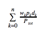
Walkshed-adjusted population-weighted average population density was calculated with the formula
where wk, pk, and dk are the percent ideal walkshed, population, and population density of the kth block group and Ptot is the total population of the metro area. The formulas for job-weighted average job density and walkshed-adjusted job-weighted average job density were the same except that job densities and numbers of jobs were used in place of population densities and populations.

