County data can’t tell us much about thriving urban neighborhoods
New county-level census population estimates became available last week, and Jed Kolko produced an interesting analysis published by FiveThirtyEight concluding that “America’s Shift to the Suburbs Sped Up last year.” While there’s nothing wrong with Kolko’s math, we think there are several reasons to believe that this data shouldn’t be taken as some have suggested, as evidence that the demand for cities is decreasing.
While some critics want to portray this as evidence that urban revival is inflated, Kolko concedes that the move back to city centers is real:
That revival is real, but it has mostly been for rich, educated people in particular hyperurban neighborhoods rather than a broad-based return to city living. To be sure, college-educated millennials — at least those without school-age kids — took to the city, and better-paying jobs have shifted there, too. But other groups — older adults, families with kids in school, and people of all ages with lower incomes — either can’t afford or don’t want an urban address.
More broadly, we think there are several key reasons why this county level data shouldn’t make anyone glum about the continuing prospects for urban growth and revitalization.
First, County level data don’t really tell us much about urban growth. We’ve made this point before with Kolko’s analysis of job growth. County boundaries correspond poorly, if at all, with cities or urban density.
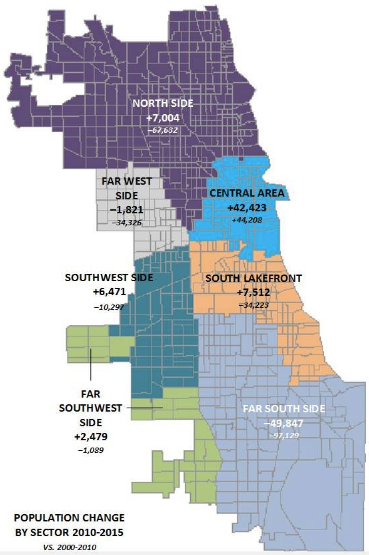
Consider Chicago, which gets tarred with the “Biggest Loser” title in Kolko’s tabulations. While Cook County saw an overall decline in population, the most urban parts of the city, including its Downtown Loop and Northside neighborhoods, continued to rack up big gains.

A more finely grained geographic analysis shows that the closer you get to the city center in most metros, the stronger has been the performance. While its true that the more outlying parts of some cities are losing population, their cores are becoming increasingly vibrant. As we’ve noted, that notion of critical mass at the neighborhood level is one of the defining characteristics of urban growth.
Second, national aggregations conceal local patterns. To be sure, these data show a renewed growth in the sunbelt. And in the biggest sunbelt metros, a big chunk of the growth is in their sprawling suburbs (Houston, Dallas). But the growth in these metros is not representative of what’s happening in many other places.
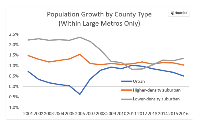
Third, there’s a baseline issue here. City growth has decelerated from the past year or two. But city growth this decade looks far different than it did a decade ago. While Kolko’s FiveThirtyEight.com post just shows the change in city and suburb growth rates over the past few years (and emphasizes the one-year change between 2015 and 2016), his longer blog post on his own website shows the change in population by type of county since 2001. Taking this longer view, its apparent that growth rates in suburbs have declined sharply since the last decade, while growth rates in urban counties were up.
Between 2001 and 2005, low density suburban counties (gray line) were growing more than 2 percent per year–their growth rates since 2011 are about half that. During that same time, the most urban counties (blue line) were growing sluggishly or losing population–and they’re now growing. While urban counties dramatically underperformed suburban ones last decade, the growth patterns have converged dramatically since then. As a result, when judged against the baseline of the previous decade, more urban counties have accelerated, while more suburban ones have faded.
Fourth, in many places we’re bumping up against the (policy-induced) limits to meeting the market demand for urban living. In the early stages of growth, cities can add population by filling vacant housing. But as vacancy rates fall, the only way to accommodate more people is to add more housing, which is a process that (a) takes time, and (b) is too often unfortunately encumbered by NIMBY building restrictions. That suburbs might grow faster than cities for a time is not necessarily evidence of a declining demand for city living, so much as it is evidence that we haven’t expanded the supply of urban living opportunities to meet that demand.


