What City Observatory did this week
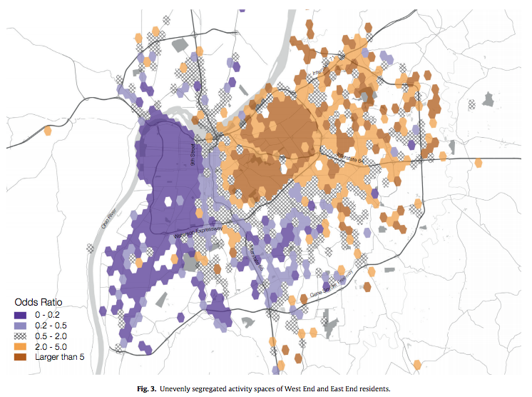
1. Daytime and nighttime segregation. Economic, racial and ethnic segregation are persistent features of the American metropolis. Most studies measure segregation using Census data on place of residence, but that’s at best an incomplete picture of the way different groups interact in urban space. Using data from social media, Taylor Shelton, Ate Poorthuis and Matt Zook have examined patterns of movement in and around the city of Louisville. They find that those who live in predominantly white neighborhoods in the city’s East End seldom travel to predominantly black neighborhoods, but that residents of black neighborhoods travel more widely through the metropolitan area. This is a great example of how new data sources can provide an entirely new perspective on an old issue.
2. Parking: the price is wrong. Donald Shoup has famously written a very thick book on the subject (The High Price of Free Parking), but every once and while there’s a clear-cut real-world example of his thoughts in action. Case-in-point: Portland, Oregon changed its policy of allowing persons with handicapped parking placards to park free at metered parking spaces. Instead, free parking was restricted to those with wheelchairs, and others with handicapped permits were allowed to buy extended time at meters. The result: almost overnight, hundreds of additional parking spaces opened up in the city center. Its a policy that other cities may want to emulate. Even in San Francisco, home to some of the nation’s most innovative parking price experiments, its estimated that 20 percent of metered parking spaces are occupied by vehicles with handicapped permits.
3. Rental supply is starting to catch up to demand. As we and other economists are constantly saying, the nation’s housing affordability problems stem from the demand for housing overwhelming its supply, particularly in desirable urban neighborhoods. One aspect of this problem is the temporal imbalance between demand and supply: demand changes quickly, but it typically takes years to plan, finance and build more housing. But there’s growing evidence that more supply is coming on line, and that it is starting to have an impact on prices. National data for the first half of the year show rental inflation decelerating compared to 2015 in most urban markets. While its too early to declare victory, it is evidence that increasing supply does influence rents.
Must Read
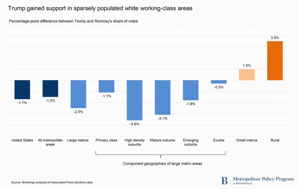
1. Small towns versus big cities. We’re awash in post-mortems of last week’s election, and are likely to be for some time. While the electorate cleaved along many dimensions (race and ethnicity, education, age, and gender), one of the most salient dimensions for City Observatory readers is geography. While much of the focus is at the “red-state/blue-state” level, a more interesting pattern is the division at the neighborhood level. Writing at The Avenue (the Brookings Institution blog) Richard Shearer presents a compelling summary of voting patterns classified by urban/rural geography, entitled “The small town-big city split that elected Donald Trump.” As we and others have noted, the voting margin for Hillary Clinton correlated strongly with urban density: more dense neighborhoods voted more strongly for the Democratic candidate. Compared to the 2012 election, the share of the vote going to the Republican candidate increased most in small towns and rural areas and in the exurbs of metropolitan areas. Donald Trump garnered a larger share of the vote in 2016 than Mitt Romney did in 2012 only in smaller metros and rural areas. His performance was decidedly weaker than Romney’s in large metropolitan areas, in high density suburbs and emerging suburbs.
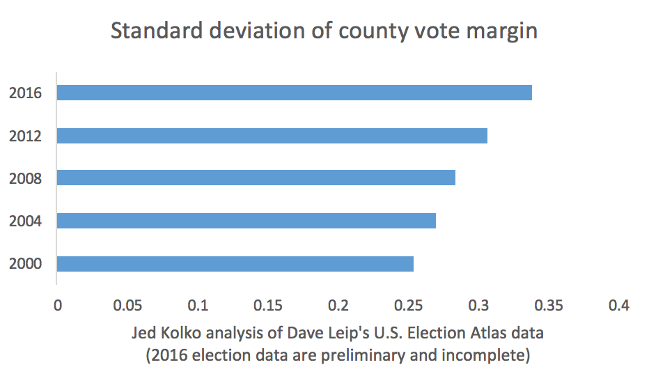
2. More evidence for the Big Sort. As the Brookings analysis makes clear, the urban rural divide was even more pronounced in this election than in 2012. Jed Kolko has summarized the long term trend in political polarization between denser areas and more sparsely settled communities. One way of measuring polarization is to look at the margin in each county (the difference between the share of votes going to the democratic and republican candidates). Kolko does this, and computes the standard deviation (a statistical measure of spread or variation). His data clearly show that the margin is growing more and more dispersed: that county level returns are, on average, less and less like the national level returns. Kolko looked at election data going back to 2000; the 2016 election was the most polarized, and this trend shows no signs of abating.
3. The pattern repeats at smaller geographies. There also seems to be a fractal quality to the relationship between density and democratic vote share: Even within smaller, more rural counties, more dense precincts tend to have a higher vote for Hilary Clinton. An analysis by the Chicago Tribune of voting patterns in Illinois counties shows that higher density neighborhoods in these rural or exurban counties tended to have a higher democratic vote share. The Tribune study shows that the vote pattern within counties on the fringe of the Chicago metropolitan area (McHenry County, which voted for Trump) and in down state counties (Rock Island, which voted for Clinton) exhibit the same red-blue pattern at the precinct level which is correlated with density.
New Knowledge
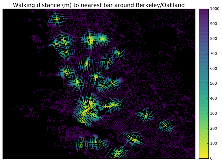
Visualizing accessibility and walkability. We’re big fans of innovative uses of data, especially new tools that reveal the fabric of urban interaction and accessibility (like Walk Score). The steady advance of open source software tools is making it possible to develop a rich array of accessibility measures. The University of California, Berkeley’s Geoff Boeing demonstrates the use of some advanced GIS techniques to show how we can visualize the access to destinations at the city level. Here’s a compelling map of proximity to bars in Berkeley and Oakland. Boeing uses similar data to show distance to the nearest school. The key point here is that these data and tools can now more easily be used–and customized–to provide more sophisticated and nuanced images of urban structure.