What City Observatory this week
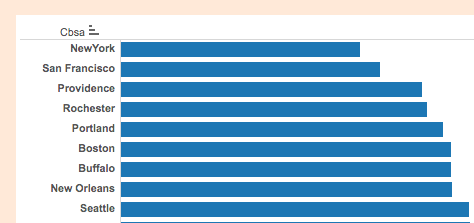
1. Local flavor: Which cities have the most independent restaurants. Local eateries are one of the most visibly distinctive elements of any city. As Jane Jacobs said, the most important asset a city can have is something that is different from every other place. Independent restaurants are a great indicator of local distinctiveness. We use data from Yelp to rank the market share of independent and chain restaurants in the nation’s largest metro areas, and find which cities have the most and fewest independent restaurants. The cities with the smallest chain restaurant market shares included New York, San Francisco, and Providence.
We also note that there’s a strong relationship between the market share of independent restaurants and the number of restaurants per capita (a good indicator of consumer choice). Cities with a higher independent market share have more restaurants per capita than cities with a higher fraction of chains. Independent restaurants equate to more different choices and more total choices, adding to local flavor in a measurable way.
2. Why cars are bad for independent restaurants. We followed up on our analysis of Yelp’s data on chain vs. independent restaurant market shares by comparing it to US Department of Transportation data on the number of vehicle miles traveled in different metropolitan areas. It turns out that there’s a pretty strong relationship by how much people drive in a metro area and the fraction of chain restaurants: more driving is correlated with a higher market share for chain restaurants.
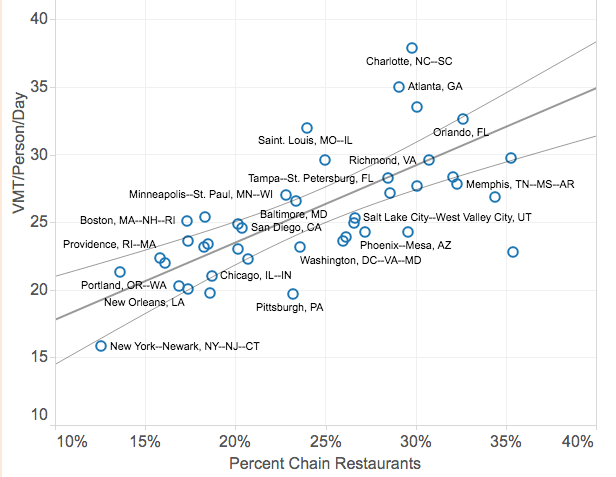
We’re not sure of the reason for this correlation, but we have some hunches. Selecting restaurants by looking through the windshield of a fast moving car is going to bias ones choices in favor of familiar, well-advertised chains. Also, cities where people drive less enjoy a green dividend: they spend less on cars and fuel and therefore have more money to spend on food, including independent restaurants.
3. Understanding Walkable Density. We’re pleased to publish a guest commentary from DW Rowlands, a graduate student at the University of Maryland at Baltimore. Her research looks into the lived density of particular neighborhoods, adjusting conventional measures of density (which ignore the connectedness and walkability of local streets) to produce a new measure of walkable density that effectively captures how easily people can interact in real world environments. Her work shows that some cities and some neighborhoods come much closer to achieving an “ideal” level of walkability: chiefly older cities and core urban neighborhoods who have traditional street grid systems. Newer metros and outlying areas, with serpentine roadways and cul-de-sacs tend to have even lower “walkable” densities than ordinary density measures would suggest.
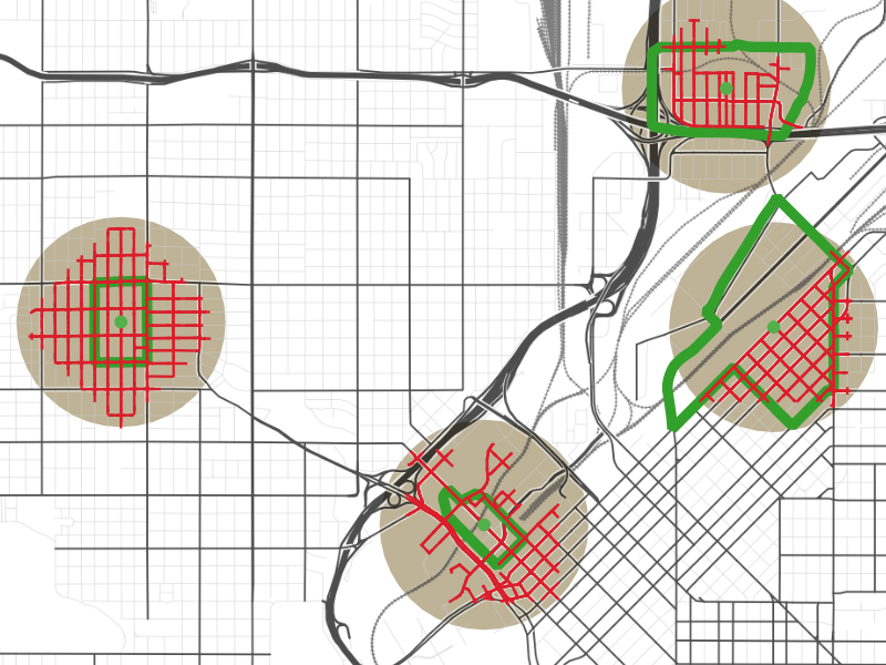
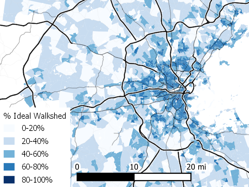
4. Mapping Walkable Density. DW Rowlands has mapped walkable density in 17 of the nation’s largest metropolitan areas. Her maps compare the actual walkable density of census tracts with their theoretical ideal density (i.e. how many people one would live near, ignoring the nature of the street network. These maps show which neighborhoods come closest to realizing their “ideal” density, with dark colors indicating places with relatively high levels of walkable density (relative to their ideal) and lighter colors showing places where actual density falls shortest of the ideal. Here’s a map for Boston:
5. Climate Failure and Denial at the Oregon Department of Transportation. As is now true nationally, transportation is the largest source of greenhouse gas emissions in Oregon. On paper, the state has a response, in the form of a “State Transportation Strategy.” In reality, it amounts to an excuse for inaction, mostly hoping that other actors (federal regulators, car manufacturers, and car owners replace current cars with clean vehicles and fuel. The trouble is its not working: Oregon’s plan called for a 10 percent reduction in 1990 emissions by this year; the state’s transportation emissions are now up 20 percent above 1990 levels–and are going in the wrong direction.
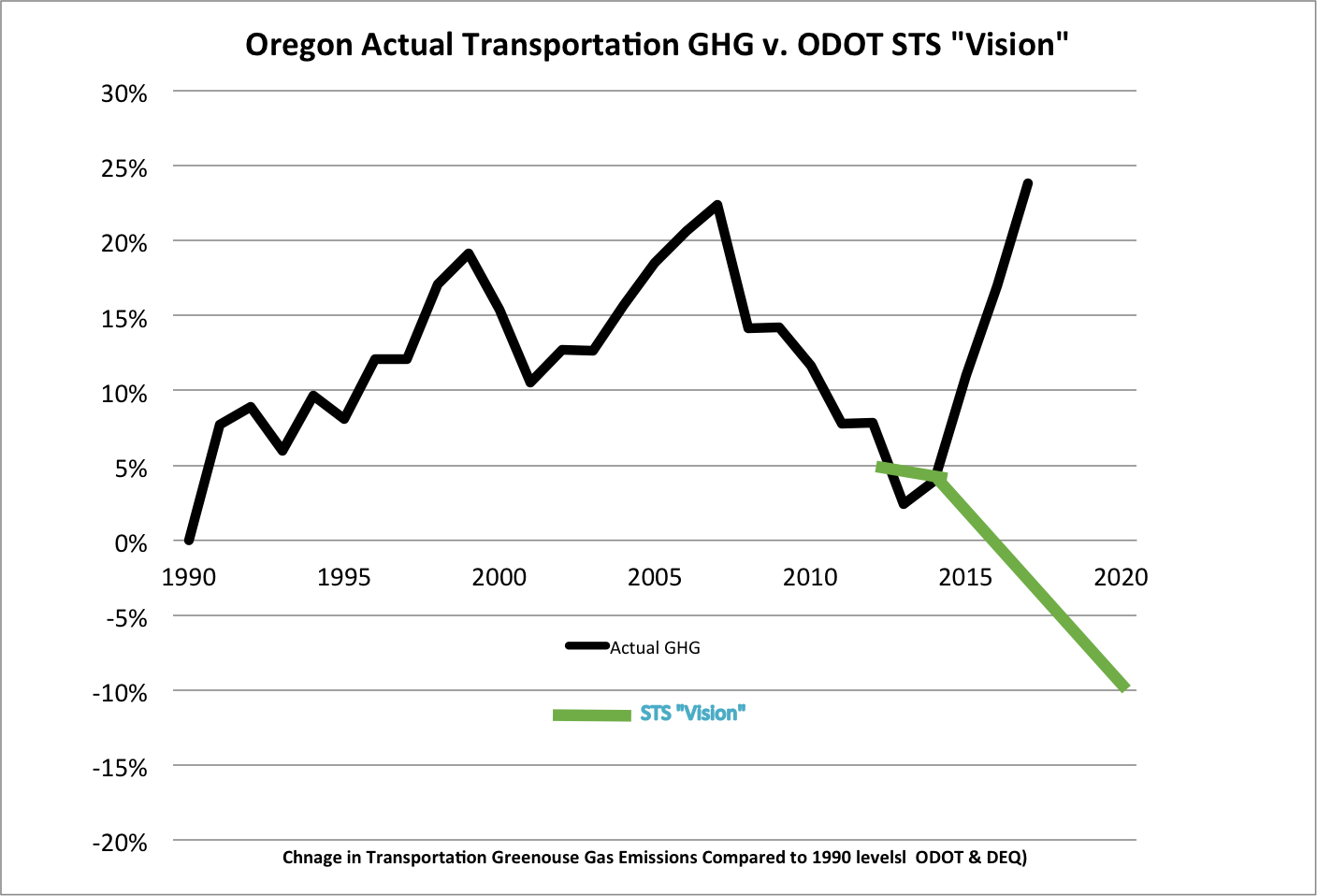
And despite its failure to make any progress, ODOT isn’t proposing any additional actions to reduce greenhouse gases–instead its planning to spend billions widening freeways. It shouldn’t be any surprise that the strategy isn’t working. The department of transportation’s “stakeholder” group included climate skeptics and deniers, who didn’t think the state mandate to reduce greenhouse gases made sense (or was worth incurring costs).
Must read
1. Rent control works best when rent control works least. The District of Columbia has had a rent stabilization law since the mid 1980s, and more than a third of the District’s apartments are covered by the law. The usual economic concern about rent control is that it tends to stifle upkeep and maintenance, encourages condominium conversions and discourages new construction. If DC’s ordinance hasn’t had all those effects, its probably because it imposes relatively modest limits on landlords: the stabilization provisions limit rent increases to the cost of living plus two percent per year. According to the DC Policy Center’s Yesim Sayin Taylor, the reason the program works so well, and why there’s been relatively less shrinkage in the rental housing stock in DC, than in San Francisco (which has tougher rent control), is because it only aims to stabilize, not restrict, rents:
D.C.’s stock of rent-stabilized units has remained so steady in part because the law prioritizes rent stabilization over strict price controls. The Rental Housing Act’s goal is not to create or preserve affordable housing, but to protect tenants from rapid, unreasonable increases in their rents.
More stringent rent controls, Taylor argues, would likely prompt landlords to convert units to condominiums, and would discourage new construction, leading to a reduction in the total number of rent controlled units.
2. More right of way for transit in Portland. As Smart Growth America notes, Portland’s City Council has unanimously adopted a plan for expanded “Rose Lanes” a network of dedicated lanes and transit signal priority on 29 streets around the city. Building on the success of some existing exclusive bus lanes, the project is avowedly experimental, with the idea of trying and as needed adjusting different treatments to speed bus operation.
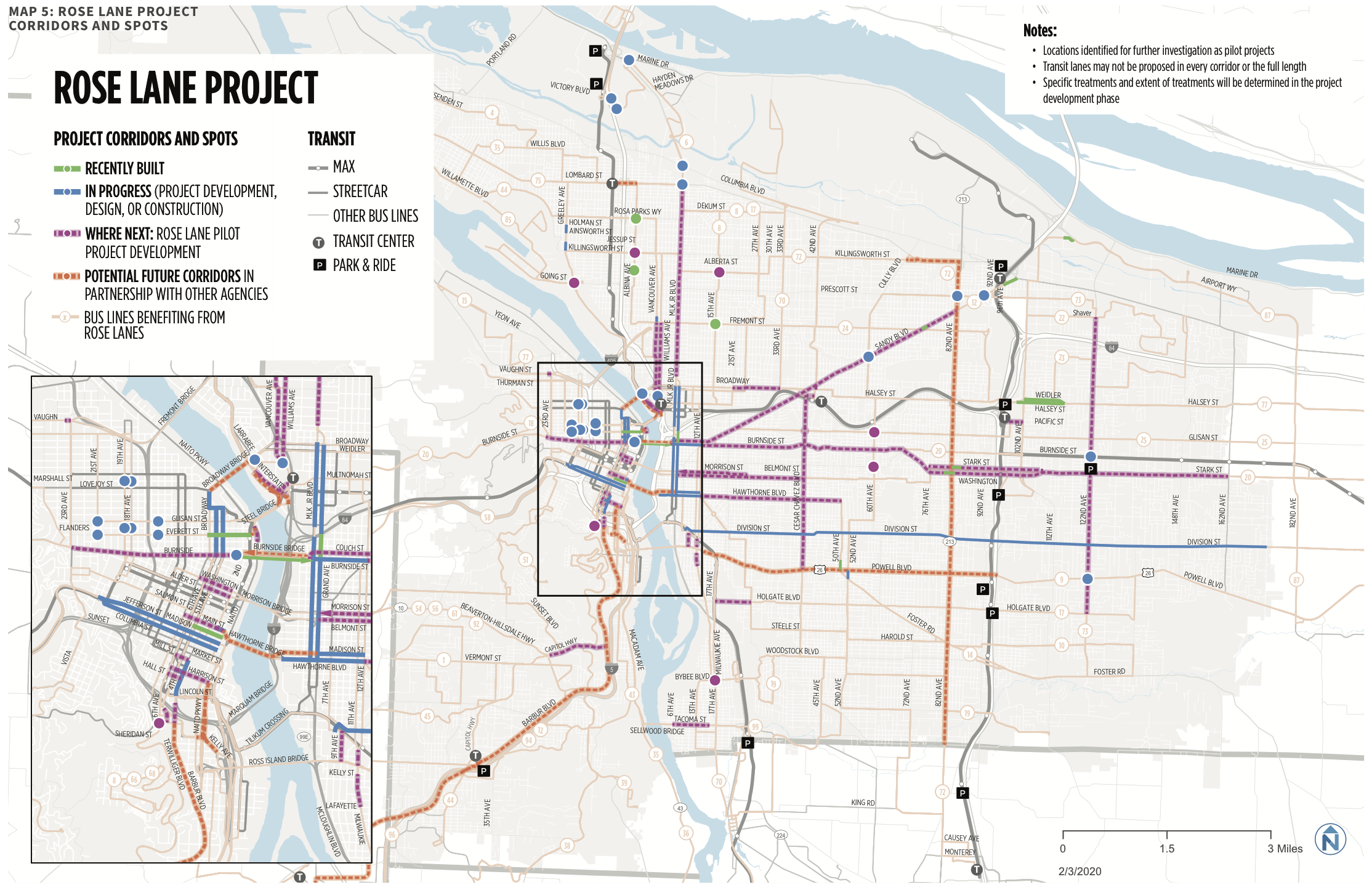
Most of the projects are designed to be relatively inexpensive and quick-to-implement. Projects are expected to roll-out city-wide this year and next. Unlike huge capital projects (light rail), these measures can provide widespread benefits, quickly, to many transit users and at low cost. As SmartGrowthAmerica concludes: “political will, more than money, can become the limiting factor in whether or not transit is truly prioritized on the street.”
3. Public opinion is shifting toward the environment and climate change. The Pew Research Center has a new survey out showing that after the waning of the Great Recession, concern about environmental issues and climate change has increased substantially. According to Pew a majority of Americans now say that both the environment generally and climate change in particular should be a top priority for the President and Congress.
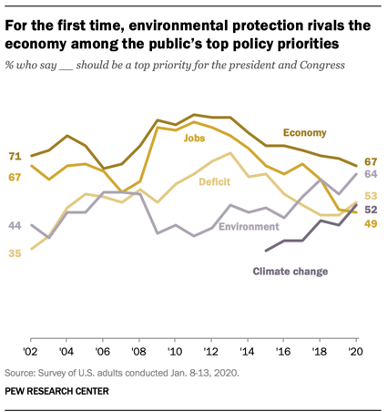
For the first time in Pew Research Center surveys dating back nearly two decades, nearly as many Americans say protecting the environment should be a top policy priority (64%) as say this about strengthening the economy (67%).
The downside: there’s a stark partisan divide on both issues: No where are Democrats and Republican’s more divided than on the importance of dealing with climate change. Some 78 percent of Democrats think its an important issue; only 21 percent of Republicans do.
In the news
The Stranger quoted City Observatory’s analysis of induced demand on Houston’s Katy Freeway in an article entitled: “Washington Democrats are damn right to remove congestion relief from state transportation goals.”
