Last week, we argued that the problem called “income segregation” is actually several problems, and broke it down with the help of different measurements designed to capture different aspects of the issue.
In particular, we pointed out the need to distinguish between 1) the segregation of poverty, 2) the segregation of affluence, and 3) the segregation of the middle—and 4) the difference between income inequality and income segregation per se.
And—although we’ll go into more detail on why economic segregation matters in a subsequent post—recall that we care enough to dive into this because both a large body of empirical research and on-the-ground experience suggests that economic integration has a major positive influence on economic opportunity, especially for people with low incomes.
Today, we’ll briefly cover how each of these problems has evolved in American cities—both over the long term, and more recently. As before, we’re largely working off of outstanding research by Kendra Bischoff and Sean Reardon, whose report is worth diving into if you want more details.
At the highest level, economic segregation trends are extremely easy to summarize: they’re up. American cities are far more segregated by income today than they were in 1970 by every measure we’re aware of, indicating more “secession of the wealthy,” more concentrated poverty, and even more sorting among the lower-middle and upper-middle income tiers.
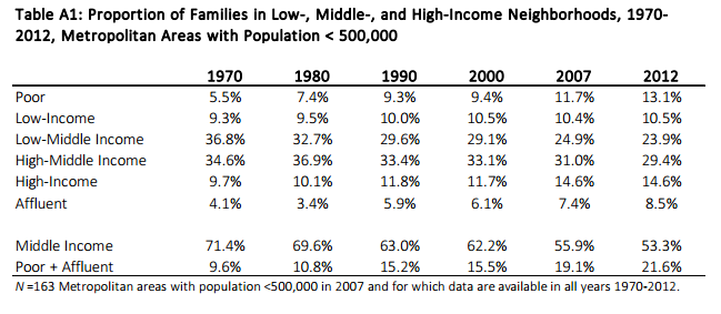
In 1970, just 8.6 percent of families lived in “poor” neighborhoods (where median income is below 67 percent of the regional median), and 6.6 lived in “affluent” neighborhoods (where median income is more than 150 percent of the regional median). By 2012, those figures had both more than doubled, to 18.6 and 15.7 percent, respectively—meaning that over a third of all families lived in either poor or wealthy neighborhoods, as opposed to just over one in seven in 1970.
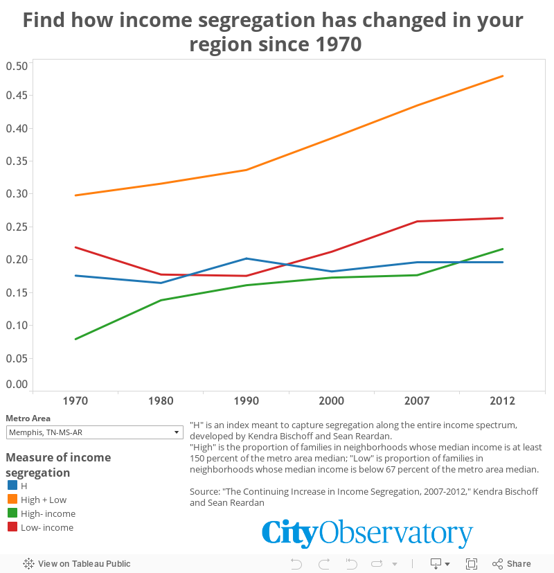
But it’s not just segregation of poverty and affluence that have increased substantially over the last few generations. Bischoff and Reardon’s “H” score—which, if you remember, measures segregation along the entire spectrum of income—has also increased, from 0.115 to 0.146. In today’s terms, a shift that size is the equivalent of moving from a metro area of average segregation almost all the way to one in the top ten percent of most segregated metro areas. In other words, it’s a lot.
And what about the question of inequality versus segregation? Is this increase in segregation simply a result of greater gaps in earnings between rich or poor, or are people actually being sorted to live with more people at their relative level? Well, recall that last time we said that the H index was valuable in part because it measures segregation by people’s income rank, rather than absolute level of income—meaning it filters out a lot of the effects of rising inequality. Since it has increased substantially, we can conclude that rising income segregation is not just a result of rising inequality. Rather, there are other factors at work promoting segregation—including some we’ve talked about at City Observatory, like zoning laws that prohibit a mix of housing types in the same neighborhood.
So while rising inequality is correlated with rising segregation, it’s not the whole story. In a previous report, in fact, Bischoff and Reardon found that inequality is mostly associated with the segregation of affluence, and less strongly correlated with the segregation of people with lower incomes.
So that’s how things have changed over the last 40 years. What about the last five?
In their most recent paper, Bischoff and Reardon focus on changes between 2007 and 2012. (For sticklers, these are actually averages of 5-year American Community Survey results from 2005-09 and 2010-2014). Over that period, income segregation has continued its rise, but the trends look somewhat different than they have over the longer term.
Over the last five years, the proportion of families in low- and high-income neighborhoods has continued to increase—but a more sophisticated look at the numbers suggest that’s more about changing income than actual segregation. Rather, Bischoff and Reardon show that most of the rise in income segregation between 2007 and 2012 came from the increasing segregation of lower-middle-income families (those between the 10th and 50th percentile of income) and upper-middle-income families (those between the 50th and 90th percentiles).
How much does that matter? It’s hard to say. Most of the research on the effects of neighborhood income on individuals’ economic, academic, or health outcomes have focused on very poor neighborhoods, or areas of concentrated poverty. But if this trend continues, it may also be worth further investigating the effects of segregation on lower-middle-income, or working class, neighborhoods as well.
Our next installment in this series will examine the relationship between income segregation, urban built form, and sprawl—and how better urban planning might mitigate some of the trends towards increasing segregation that we’ve just discussed.
Until then, you can look up how your region has fared on the interactive tool we’ve created below, based on data from Bischoff and Reardon.