Concrete covers are just a thinly-veiled gimmick for selling wider freeways
As you’ve read at City Observatory, and elsewhere (CityLab, Portland Mercury, Willamette Week), Portland is in the midst of a great freeway war. The Oregon Department of Transportation is proposing to widen a mile-long stretch of Interstate 5 opposite downtown Portland from 4 lanes to 6, at a cost currently estimated at just under half a billion dollars. There’s notable opposition to this idea, which flies in the face of the city’s stated aims of reducing greenhouse gas emissions and promoting Vision Zero.
One of the chief selling points of the project is the claim that it will “cover” the Interstate 5 freeway. Calling it a cover conjures up visions of a roadway completely obscured from public view, and topped by a bucolic public space.What that immediately calls to mind, especially for those in the Pacific Northwest is Seattle’s “Freeway Park” constructed over Interstate 5 in the city’s downtown. It provides public space in the form of nearly five acres of tree-shaded, lawns, plaza’s and stairways.

But what’s actually being proposed for Interstate 5 is less of thick, verdant freeway-obscuring park and more of a skimpy concrete g-string. When you look closely at the project’s own illustrations, its apparent that the covers are actually just slightly oversized overpasses, with nearly all of their surface area devoted to roadway.
Each of the covers is bisected by one more of the four principal arterials that cross over the Interstate 5 freeway in the project area. One cover carries N. Vancouver Avenue over the freeway; the other carries N. Williams, NE Broadway and NE Weidler. Each of these streets is a heavily traveled automobile thoroughfare in its own right, so these covers are mostly devoted to carrying cars, not providing public space.
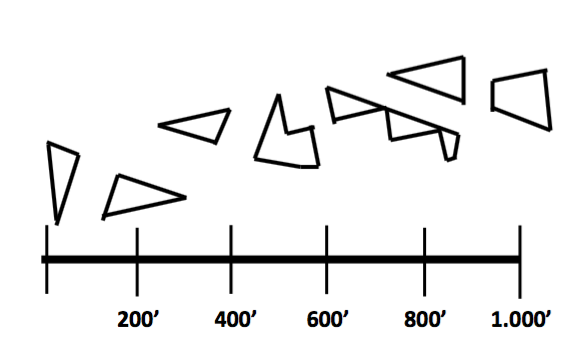
The clearest way to appreciate the absurdity of describing these covers as public space is to map them and subtract out the portion of the covers that is devoted to roadway. Portland’s Jim Howell, a long time transit advocate has done just that. What you really have is seven irregular trapezoids, hemmed in on nearly every side by roads or the freeway itself. Here’s Howell’s diagram:

For reference, Portland’s celebrated small city blocks are about 200 feet on a side; so none of the areas offered up here is much more than about a quarter of block of useful space. These remnants are hardly the site of any viable public space, and certainly not places where anyone, surrounded by car traffic, is likely to linger. In fact, they greatly resemble existing orphan land near the current I-5 freeway interchange, owned by the Oregon Department of Transportation, and not improved in any way, or even maintained:

These tiny fragments don’t work as a public space, and can’t ever be made to be an actual public space, because they that was never the intention: The “covers” exist only to provide a deceptive talking point to help sell a freeway widening project. Plus, enveloped in freeway noise and pollution, and surrounded by fast moving car dominated arterials and freeway ramps, this will be a supremely hostile environment for pedestrians and cyclists. Anyone familiar with the Oregon Department of Transportation knows what a low priority it attaches to pedestrian improvements urban streets it controls. A few blocks East of this project, on Martin Luther King Boulevard, ODOT refused to add pedestrian improvements to a traffic island being landscaped to include a memorial to the civil rights leader.
These covers can’t support the Albina Vision
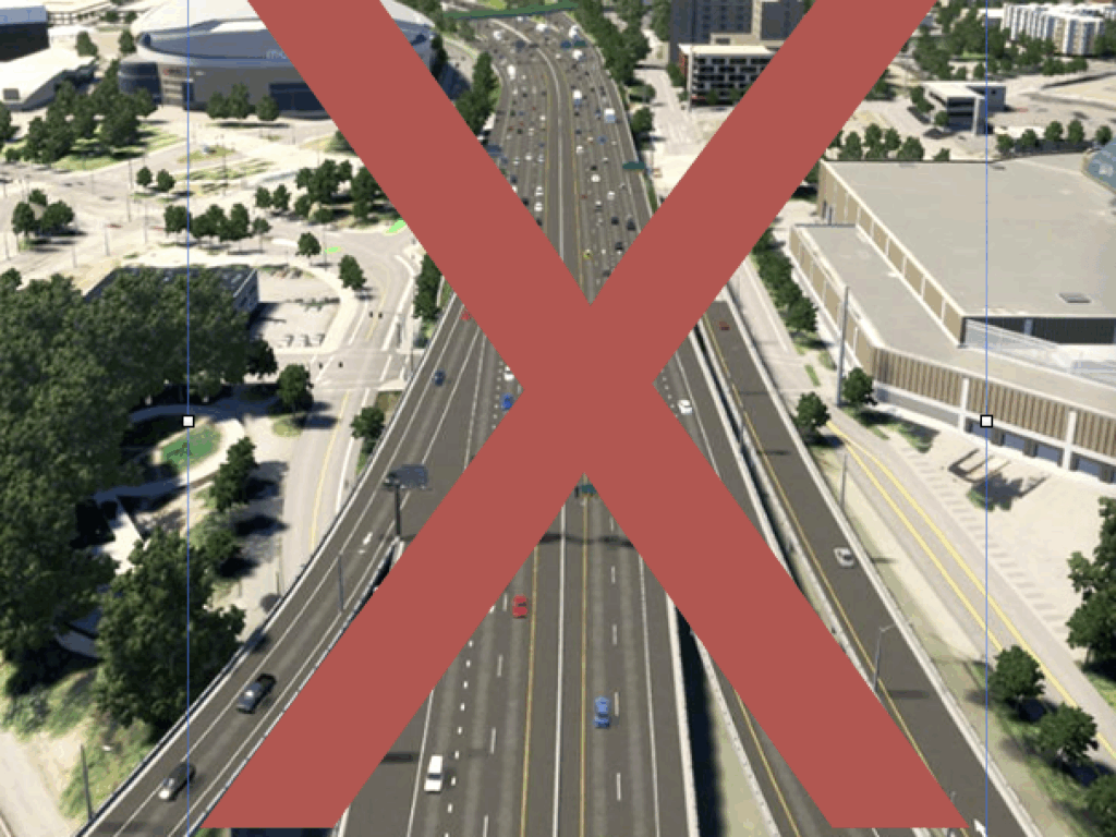
Project advocates have also seemed to conflate the freeway widening project with a speculative redevelopment scheme called the Albina Vision, which so far consists almost entirely of the following rendering, which shows entire area between the freeway and the Willamette River, including the parking lots surrounding the region’s two principal arenas–the Moda Center and the under-used Memorial Coliseum–being redeveloped into high rise apartments and offices, along with vast new public spaces. (Where the money would come from to pay for such a project hasn’t been identified).
The project’s rendering has neatly made both the Interstate 5 freeway and its extensive on- and off-ramps disappear under a welter of new high rises, details very much at odds with the project proposed by the Oregon Department of Transportation.
The Long History of Using Misleading Images to Sell Urban Highways
It’s tempting to imagine that a “cover” could magically erase the scar created by running a multi-lane freeway through an urban neighborhood. Using this kind of illusion and creatively mis-representing the visual impact of a new construction has a long history in the world of selling highways. Robert Moses famously skewed the illustrations of his proposed Brooklyn Battery Bridge (which would have obliterated much of lower Manhattan and Battery Park); we turn the microphone over to Moses’ biographer Robert Caro, from The Power Broker
Moses announcement had been accompanied by an “artist’s rendering” of the bridge that created the impression that the mammoth span would have about as much impact on the lower Manhattan Landscape as an extra lamppost. This impression had been created by “rendering” the bridge from directly overhead—way overhead—as it might be seen by a high flying and myopic pigeon. From this bird’s eye view, the bridge and its approaches, their height minimized and only their flat roadways really visible, blended inconspicuously into the landscape. But in asking for Board of Estimate approval, Moses had to submit to the board the actual plans for the bridge. . . .
The proposed bridge anchorage in Battery Park, barely visible on Moses’ rendering, would be a solid mass of stone and concrete equal in size to a ten-story office building. The approach ramp linking the bridge to the West Side Highway, a ramp depicted on the rendering as a narrow path through Battery Park, would actually be a road wider than Fifth Avenue, a road supported on immense concrete piers, and it would cross the entire park—the entire lower tip of Manhattan Island—and curve around the west side of the island almost to Rector Street at heights ranging up to a hundred feet in the air. Not only would anchorage and piers obliterate a considerable portion of Battery Park, they—and the approach road—would block off much of the light not only from what was left of the park but also from the lower floors of every large office building they passed; because the approach ramp was really an elevated highway that would dominate the entire tip of Manhattan, it would depress real estate values throughout the entire area.
If Portland wants to have more green space, less impact from the Interstate 5 freeway, and something resembling the higher level of density depicted in the Albina Vision, it shouldn’t squander half a billion dollars widening the freeway and creating badly fragmented, noisy and unusable trapezoids of concrete on a pair of oversized over-passes. Instead, it ought to ask how half a billion dollars could be invested to make this neighborhood, the city and the region a better place in which to live.


