In my inaugural post, I claimed that county-level population data is bad at telling us much of anything about cities and housing preferences. Counties just contain too many multitudes – of built environments, of types of neighborhoods, of zoning regimes – and vary too much from place to place to be very useful in cross-metro comparisons.
But happily, as of February, we have a much better way of turning the millions of moving parts in a given metropolitan area into a coherent story. That’s when Luke Juday of the University of Virginia’s Cooper Center for Public Service published “The Changing Shape of American Cities.”
“The Changing Shape” includes a traditional PDF report, which emphasizes the emergence of what writer Aaron Renn has called “the new donut”: a wealthy core, surrounded by a ring of relatively low-income outer city neighborhoods and inner suburbs, surrounded by wealthy outer suburbs. That, of course, is very much worth reading.
But what really makes our hearts go pitter-patter is this:
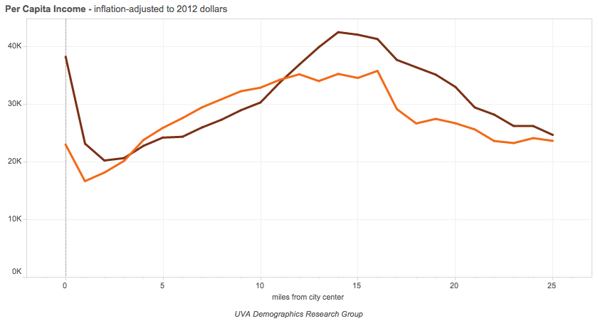
If you click over, you’ll see an interactive data presentation for over sixty metropolitan areas – as well as a handful of regional groupings – that shows how each region’s demographics change as you move further from the city center. As you move from left to right on the graphs, you literally travel through the city, beginning downtown and then following the trends mile by mile. The data illustrate the “new donut” phenomenon as well as anything I’ve seen, showing, for example, a steep peak in residents’ college attainment at the city center, then a deep trough, and a second peak several miles out. Here, for example, is the graph for college attainment, aggregated over eight Rust Belt cities – places you wouldn’t necessarily expect to be seeing lots of privileged people moving downtown:
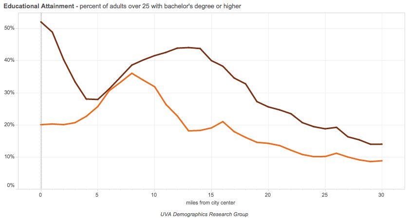
The purple line shows the data from 2012; just as dramatically, the orange line shows the data from 1990, back when American cities followed the “old donut” model: a poor inner city and wealthy suburbs.
What’s so valuable about this presentation of metropolitan data – as opposed to county, or even municipal, based analysis – is that it doesn’t require the historical accidents that are government boundaries to correspond with subtle and ever-changing social and economic geography. By simply showing what happens to, say, the proportion of residents living under the poverty line as we move mile by mile through a metropolitan area, we get a much better sense of a region’s shape than we do by drawing a handful of sharp lines and measuring how many people fall on one side, and how many on the other.
Juday’s work even gets past some of the issues of more sophisticated approaches to urban categorization. For example: Trulia’s Chief Economist, Jed Kolko, recently made an urban/suburban distinction based on whether most housing units in a given neighborhood were in multi-family or single family buildings. In America’s biggest, densest cities, that makes a lot of sense: most New York- or Chicago-area neighborhoods where most people live in single family homes are probably not considered very “urban” there.
But in a lot of other places, especially medium-sized cities away from the East Coast, that standard doesn’t necessarily apply. The Midtown district of Memphis, where I lived for a year, generally looks like this:
In other words, it’s mostly single family homes. But it’s also centrally located, and, in the Memphis area, is popular specifically for its centrality, relative density and walkability, and other “urban” amenities. Kolko’s criteria, though they sound perfectly reasonable at first blush, mischaracterize the role Midtown plays in Memphis – and the role that many other similar neighborhoods play in their regions across the country. Juday’s charts, on the other hand, easily register Midtown’s popularity among the young and well-educated as a close-in neighborhood.
Of course, no form of analysis is perfect. One thing that you can’t see in these visualizations is the phenomenon of the “favored quarter.” That is, demographic patterns tend not to form perfect concentric rings around a city center: more often than not, they’re a composite of rings and wedges, beginning downtown and moving out in one direction. That, too, has been well-presented by Radical Cartography, among others.
But that is a relatively small issue. “The Changing Shape of American Cities” is an excellent approach to urban demographics, and the fact that the data are publicly available to play around with in an interactive display means there should be many, many more insights to come from Juday’s work.
