A recent post from the excellent DC blog Greater Greater Washington has made a few ripples among transit advocates. In it, David Alpert takes the growth rate of WMATA’s operating costs (about 6% annually) and its operating revenue (about 1% annually) and makes the straightforward point that this isn’t really sustainable.
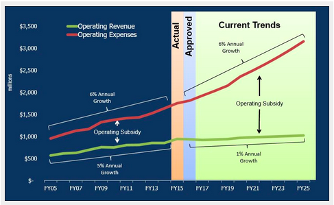
After all, these rates of growth suggest that WMATA is either going to have to grow its operating subsidy significantly every year just to maintain the same level of service—or start cutting service, which in turn will reduce revenue, which may lead into the kind of transit death spiral that has affected cities around the country.
Unfortunately, it looks like the DC area isn’t the only place dealing with inflated operations costs. Going off of our work on the decline in bus service in many parts of the country, we took a look at bus operations costs since 2000. To take into account changes in service levels, we measured operations costs per “vehicle revenue hour”: that is, how much it costs, on average, to run a bus for an hour. Among all urbanized areas with at least a million residents, the “price” of an hour of bus service increased by an average of almost 14 percent between 2000 and 2013—after taking into account inflation.
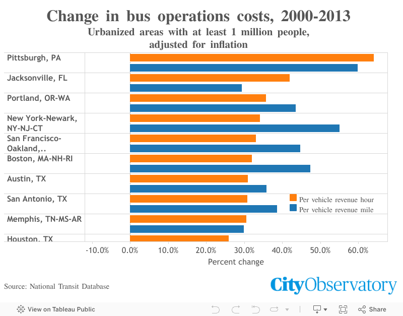
(Note that this chart has a second measure: costs per “vehicle revenue mile,” or the “price” of a mile of bus service. For various reasons, hours are probably a better metric, but we’re including both here for the sake of transparency.)
Now, this all needs some caveats. We got this data from the National Transit Database, which in turn got it from the transit agencies themselves. In previous work with the NTD, we’ve been appraised of various inconsistencies that make the numbers not always directly comparable, either from agency to agency or sometimes year to year. But the strength and breadth of the trend here—plus the fact that it appears to confirm other reports of rising transit operations costs, like at WMATA—make this something we think is worth looking at more closely for anyone who cares about cities and public transit.
Because every increase in the “price” of an hour of transit means that agencies need more money just to maintain current levels of service, let alone add new lines or increase the frequency of existing ones. In Houston, for example, operations costs per vehicle revenue hour have increased nearly 26 percent after inflation since 2000—requiring either massive increases in ridership to boost revenue or massive increases in subsidies. Or, worse, requiring massive service cuts to match funding with the new cost of providing transit.
And, in fact, metropolitan areas where bus service costs went up the most over this period were also likely to have seen some of the largest service cuts.
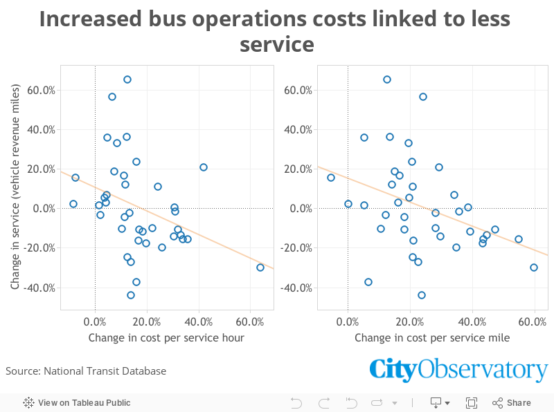
It’s not clear, however, which way the causation runs. On the one hand, this is exactly what you’d expect to see if rising operations costs were causing transit agencies to cut service. On the other, there are large fixed costs to operations—administration, scheduling, garages, and so on—which means that reducing service probably won’t reduce operations costs proportionally, and so costs per mile, or per hour, will go up, even if there’s no underlying efficiency problem. So we can’t say for sure what these charts mean—but they’re certainly consistent with a story in which WMATA’s unsustainable path is a situation lots of transit agencies find themselves in.
If that’s the case, it means a pretty dire prognosis for the future of transit services that form the backbone of low-cost, highly-space-efficient urban transportation. Why hasn’t this become an issue earlier? Partly, it may be that transit costs (like road costs) are mostly invisible to users: they pay their fare, but don’t see the underlying subsidy.
If operations costs continue to rise, of course, they will—either through higher taxes or reduced service. The numbers we’ve presented here are just a first stab at whether this is something we ought to be concerned about nationally. We think they suggest that there is something to look into—and we hope to be joined by urbanists with better data and more local knowledge to give us a better idea of what exactly is going on.
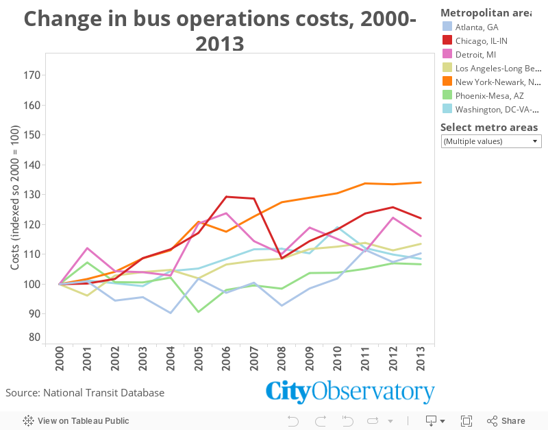
And just for fun, here’s an interactive graph where you can see the change in operations costs by urbanized area, by year: