The Dow Jones Industrial may be down, but the Dow of Cities is rising
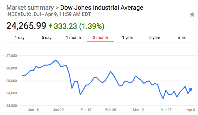
The daily business news is obsessed with the price of stocks. Widely reported indicators like the Dow Jones Industrial average gauge the overall health of the US economy by how much, on any given day (or hour, or minute) investors are willing to pay for a bundle of stocks that represent the ownership of some of the nation’s biggest businesses. After peaking in January, investors have become decidedly skittish and pessimistic about the US economy, as evidenced by wild daily gyrations and an overall fall of almost 10 percent the Dow Jones Industrials (DJI).
 At City Observatory, we’ve applied the same idea–a broad market index of prices–to America’s cities. We’ve developed an indicator we call “The Dow of Cities.” Like the DJI, we look at the performance of a bundle of asset prices, in this case, the market values of homes in the nation’s densest urban neighborhoods. And because we’re focused on cities, we compare how prices for houses in cities compare with the price of houses in the more outlying portions of metro areas.
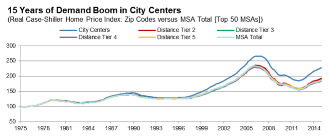
Here’s the simple number: since 2000, home prices in city centers have outperformed those in suburbs by 50 percent. In graphic terms, it looks like this:
The data were complied by Fitch–the investment rating agency, in a report released with the announcement that “U.S. Demand Pendulum Swinging Back to City Centers.” What the data show is that the dark blue line–which represents housing in city centers–is consistently outpacing the other lines–representing increasingly suburban rings of housing. The premium that the most urban houses command over the rest of the metro housing stock reflects the growing market value Americans attach to urban living.
If you care about cities, and you’re looking for definitive evidence of the verdict of the market on urbanism—this is it. But we are also resigned to the fact that we are geeks, and stuff that gets our blood-racing leaves most people cold. So I’m groping for an analogy: the most convenient one is to the stock market.
Image a CNN business reporter saying:
“In the market today, city centers were up strongly to a new high”
Or a Wall Street Journal headline
“A bull market for city centers”
That’s the news here. Just as with private companies this price index is a great indicator of market performance. Imagine for a moment if you were CEO of Widgets, Inc, a publicly traded company. Every day, you’d be getting feedback from the market on how well you were doing, and on investor’s expectations for your company’s future. If your stock price went up, it would be a good indication that you were doing better, and that expectations were rising for future performance. Especially if you had a sustained rise in your stock price, and if your company were regularly outperforming both other companies in the widget industry, and the overall stock market. The reason the investment world is gaga over Warren Buffet is pretty much because he’s been able to do just that with the portfolio of companies he’s assembled under the Berkshire-Hathaway banner.
Wouldn’t it be great if we had the same kind of clear cut financial market style indicator on the health and prospects of our nation’s center cities? Wouldn’t it be useful if we could show in a stark and quantitative way how city centers are performing relative to suburbs? That, in essence, is what the Fitch data shows. Fitch’s analysts looked at 25 years worth of zip code level home price data in 50 of the nation’s largest metropolitan areas to track how well city centers performed compared to surrounding neighborhoods and suburbs. They divided zip codes within metropolitan areas into four groups based on their proximity to the city center.
You can’t literally buy stock in a city, but buying a house is the closest thing imaginable. The price a buyer is willing to pay for a home in a particular city or neighborhood is a reflection both of the current value of that location, and the buyer’s expectations of the future character and performance of the neighborhood and city. Add up all the home values in the city, and you’ve got an indicator of the market for the city as a whole.
This Fitch chart is, in effect, a kind of Dow Jones Index for the performance of the nation’s center cities. It clearly shows that over the course of the last housing cycle—beginning before the big run up in housing prices, but then continuing through the housing bubble, and growing during the bust and recovery, is an ever wider edge of city center housing prices compared to more suburban, out-lying locations. And this isn’t a short term aberration or a recession artifact. The Fitch data show the trend emerging in the late 1990s, and growing steadily over time.
While there’s a growing recognition that cities are back, in some quarters there’s denial. The truly great thing about this measure its it definitively puts the lie to the claims by perennial city nay-sayers like Joel Kotkin that the overall growth or size of suburbs is somehow a manifestation of their revealed economic superiority. In economic terms, bigger doesn’t necessarily mean better. In the economic world, market prices, and particularly changes in relative market prices are the best indicator of what’s hot and what’s not. The new Fitch analysis make it abundantly clear that cities are hot, and suburbs are not.
The reason of course is that housing demand can (and is) changing much faster than supply—which is why prices are rising so much. Rising prices are both a positive indicator of the value consumers place on city center living, and a reminder that as we’ve said many times at City Observatory, we’re experiencing a shortage of cities. And the rising relative prices for city locations are the market’s way of saying “we want more housing in cities” and “we want more cities.” While the strength in the housing sector has been an urban focused boom in new rental apartments, the fact is that supply isn’t growing rapidly enough. We aren’t creating new San Franciscos and new dense, walkable, transit-served neighborhoods in other cities as fast as the demand for urban living is increasing—and that means that prices are continuing to rise.


