The Opportunity Atlas: Stunning neighborhood maps of economic opportunity
Some of the most important research findings of the past decade have come from the work of Raj Chetty and his colleagues at the Equality of Opportunity Project. They’ve shown convincingly, the effect of community attributes on the life chances of kids. Their latest work, The Opportunity Atlas, is a masterpiece of data analysis, presentation, and accessibility. It’s a detailed set of nationwide maps (with embedded data) that shows how individual neighborhoods influence the life chances of children. If you really want to understand how your neighborhood is–or isn’t–working for the kids growing up there, you’ll want to immediately go to this site, and spend a lot of time looking at what it shows.
One of the limits of most of our socioeconomic data is that it is based essentially on a series of disconnected, one-time snapshots of city or neighborhood conditions. But Chetty’s work is unique in that it is a longitudinal look at change over time, for example, looking at the adult earnings and other outcomes (employment marriage, incarceration) based on where children grew up. Another limitation of most analyses is that even our biggest data sets, like the American Community Survey, are based on sample data, so there’s a pretty noticeable margin of error, especially in estimates for small geographies. Chetty and his researchers had access to the complete tax return data of Americans (anonymized, of course), to construct their Opportunity Atlas. The Atlas is based on records for 20 million children born between 1978 and 1982, tracking their progress through their thirties. The data was assembled with the support and assistance of the Census Bureau. Taken together, this data gives us a unique and detailed view of the ways in which community characteristics influence intergenerational economic mobility and a range of social outcomes.
The Atlas of Opportunity takes this extraordinary analysis of lifetime outcomes to a whole new level: the neighborhood level. While previous work used the geography of commuting zones (areas slightly larger than metropolitan areas) or counties to analyze variations in lifetime outcomes, this new work mines and presents data down to the neighborhood level using Census Tracts (areas that average a population of about 4,000).
In addition to the geographic detail, there are a wide range of measures of success. The data includes adult earnings, but also reports the fraction of persons incarcerated as adults–again based on the neighborhood in which they grew up. There’s also data on marriage, college attendance and fertility.
And all their work is delivered transparently in an on-line resource that lets you look at neighborhood by neighborhood variation in outcomes by the income, race and gender of different households. For example, you can look at within city variations in the adult earnings of girls from low income Hispanic families based on the neighborhood in which they were raised. There’s even data reporting what fraction of kids who grew up in a particular neighborhood remained in the same city as adults.
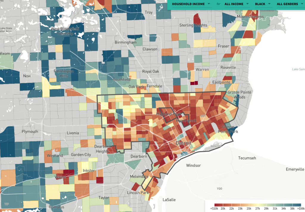
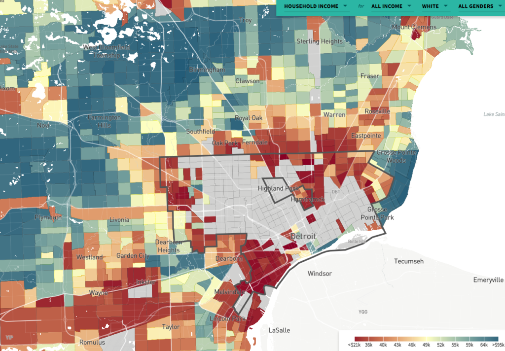
For example, here are a couple of detailed maps for the Detroit metropolitan area that compare the adult earnings of black kids and white kids based on the neighborhoods that they grew up in in the 1980s. Reds and oranges correspond to relatively low adult earnings; blues and greens correspond to higher adult earnings.
Detroit: Income of black kids who grew up in these neighborhoods
This map illustrates the relatively low adult earnings for black children who grew up in the City of Detroit. Except for a handful of neighborhoods, adult incomes were in the bottom half of the distribution. Meanwhile, black children growing up in suburban neighborhoods, especially to the northwest and southwest of Detroit proper, earned more as adults.
Income of white kids who grew up in these neighborhoods
The second map shows the adult earnings of white children based on the neighborhoods they grew up in. Earnings tended to be lowest for those who grew up nearest to the city of Detroit (the city’s boundary is shown as a black line). Those who grew up in more distant suburbs tended to have the highest adult earnings.
The negative space on these maps also clearly show one other feature of the Detroit area: the profound racial segregation of the city and its suburbs. The gray areas on each map represent neighborhoods where there were too few observations (fewer than 20 children) to make statistically valid estimates of outcomes, i.e. too few black children (upper panel) or too few white children (lower panel). A huge swath of the suburbs to the North and to the West of Detroit had too few black children to produce estimates; a majority of neighborhoods in Detroit had too few white children to produce estimates. (A hat tip to New York Times Upshot reporter Emily Badger for pointing out how the Chetty work illustrates the neighborhood segregation.)
What we’ve shown here–adult incomes for kids growing up in just one city–is just a tiny fragment of what’s available and possible using this website. There’s so much more here than we can possibly describe in a single commentary. The website allows you download data for individual neighborhoods, upload your own data so that you can examine how other factors inter-relate to the opportunity measurements presented here. There are a series of case-study stories that describe different aspects of the data as they play out in different communities around the country.
This is truly one of the most extraordinary resources available for understanding cities.


