The most difficult design challenge is asking the right question
Not long ago, a feature article at the New York Times described how the design wizards at IDEO are helping stodgy old Ford Motor Company re-imagine how transportation might work in the future.
IDEO conceptualized the design task by sending groups of its employees to a restaurant a few miles away via different transportation modes, so they could assess the challenges each faces: the subway (too smelly), Divvy bikeshare (too dirty), and Uber (too expensive).
The hope is this exercise sheds light on how will enable IDEO to brainstorm clever new ways to get from point A to point B in the future. (We’re pretty sure the solution will involve apps.)
In our view, this is an epic fail for several reasons. First, it just gets certain things wrong. For example, according to the article, one of IDEO’s big complaints about the subway was the lack of cellphone reception—a problem the CTA had already announced it would be fixing when they took their ride in October, with full coverage in all subways rolled out in December.
But there’s a more fundamental problem: Is the optimal place for a quick work lunch four miles from IDEO’s office? If it is, isn’t the real problem here that a company has located its office in a place where its employees have to travel four miles just to get lunch and have a meeting? And isn’t the restaurant’s problem that it’s located in a place where its customers are four miles away?

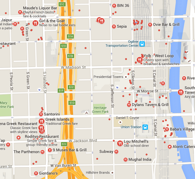
And in fact, IDEO has already solved this particular design problem for itself. Fork and Tine, the restaurant they chose, might be four miles away, but there are dozens and dozens of restaurants within a quick walk of its downtown offices. City Observatory’s Chicago bureau chief, Daniel Hertz, spent an afternoon walking around IDEO’s West Loop neighborhood to find a bite to eat in the name of research. A five minute walk in one direction is Greektown, where you can get a quick gyro or souvlaki. A few minutes north of there is Randolph Street, one of the premier dining destinations in the city, with everything from high-concept burgers to Indian curries. Or, just about ten minutes straight north of IDEO’s offices is the French Market food court at a major commuter rail station, a hugely popular workday lunch spot. Not to mention that you pass at least a couple places to eat on every block on your way to any of these destinations.
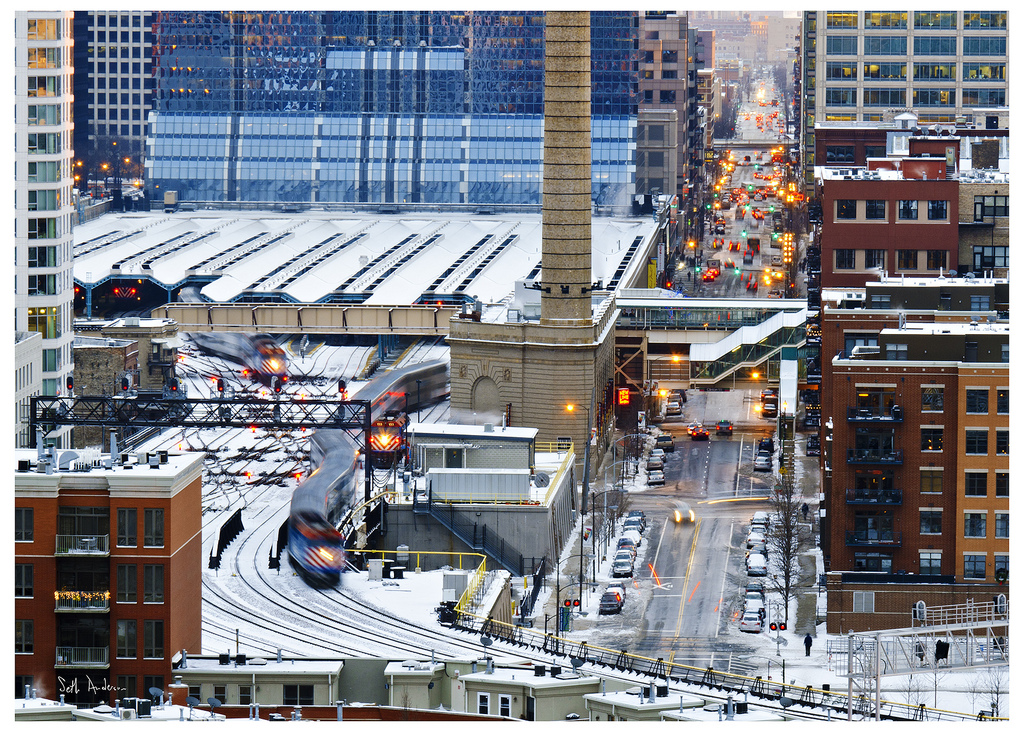
It’s not a coincidence that there’s so much to do within a quick walk of IDEO’s offices—that’s almost certainly a major reason they chose to locate in the West Loop. Indeed, it’s a big reason that Chicago’s downtown has seen a steady stream of companies opening new or relocated offices there.
In other words, the issue here has at least as much—if not much more—to do with the design of cities than the relatively superficial features of different transport modes.
With rows of restaurants down the street from the IDEO offices, they don’t have to travel at all, save to walk a few hundred feet, saving them bundles of valuable time. So being in a dense urban location turns out to be the optimal design solution: relying as it does on the healthiest, least expensive, lowest carbon and most fully deployed transport technology in human history: walking. IDEO already knows this: that’s why they pay premium rents for their tidy, exposed-brick office space in the West Loop.

One of the subsidiary tasks IDEO assigned its testers was schlepping a couple of large shopping bags—to simulate, in some way how a busy person might have to mix some domestic errands with their business lunch. Fair enough. But if one lived in a mixed use neighborhood, where there was say a corner store or bodega down the block, one might easily handle all one’s shopping with more frequent but much more convenient walking trips to buy just a handful of necessities, rather than having perforce to carry a week’s worth of groceries because it was several miles to the big box store.
If we think about it correctly, dense, mixed use urban spaces are the ultimate design solution to our transportation problems. They provide low-cost, no-carbon, time-saving access to all manner of things that consumers want and need in their daily lives.
The real failure in design thinking here is IDEO viewing this task as primarily choosing between different transportation modes. Of course, they are free to frame this question however they—and their paying client—would like. But from a broader policy perspective—and from the perspective of citizens and consumers, we’d all be a lot better off if we’d make the design conversation about how we arrange our cities. And the design lens is often blinded by the look and feel of things, rather than comprehending basic, systemic issues: the quality of bus service, for example, has much more to do with schedule frequency, and running times, than the features of the transit system’s arrival time notification app: we think bus riders would be much more impressed with buses that arrived every ten minutes and made the trip faster thanks to dedicated lanes, than they would be by an app that told them the next bus was exactly 22 minutes from now.
Just focusing on transportation ignores and rules out the very substantial gains that could be made by better designing our cities for living. It’s hard to get the right answers under the best of circumstances. It’s just impossible to get the right answers if you ask the wrong questions.
A version of this commentary originally appeared at City Observatory in February 2016.
