The Covid-19 pandemic has played out very differently in different metro areas; some have been devastated, others only lightly touched and these patterns have shifted over time.
Among US metro areas with a million or more population there is a more than 20-fold difference in cases per capita between the hardest hit and the least hard-hit
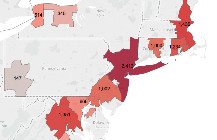
The Northeast metros from Washington to Boston have been the “Covid-Corridor”
Some cities that avoided the pandemic early, were hard hit later; others who were hit early, managed to contain the spread of the pandemic. Minneapolis & Seattle represent cities on different trajectories.
Wide variation in prevalence across metropolitan areas
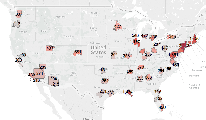
The impact of the Covid-19 pandemic has been extremely uneven across the nation’s large metropolitan areas. The typical large metropolitan area had about 340 reported cases per 100,000 population through May 29. But that median masks wide variation among cities. The hardest hit areas, like the New York City metro area, have an incidence of Covid-19 cases (more than 2,400 per 100,000 population) that is about 20 time higher per capita than it is in the least affected large metros (Portland and Sacramento, 112 and 80 cases per 100,000, respectively). Put another way, if New York had experienced the pandemic the way these cities did, it would have had 95 percent fewer cases and deaths. In the case of metro New York, that would work out to more than 30,000 fewer lives lost—so far.
As we look across the country, there’s are a combination of clear patterns of more severe infection, as well as some isolated hotspots. The entire Northeast Corridor stands out as having the largest concentration of cases. Other cities have had severe outbreaks, with rates very different than the rest of their region. New Orleans with 1,400 cases per 100,000 residents has the second highest prevalence of the virus of any large metro area, but other metro areas in the South generally have rates that are below the national average. Nearby Houston, for example, has a rate of just 240 per 100,000.
The Covid-Corridor
While the New York City metropolitan area has been the epicenter of the pandemic, it is clear that the entire Northeast Corridor, from Washington to Boston, has borne the brunt of the disease. Six of the eight large metropolitan areas with the highest prevalence of reported cases are in the Corridor.
As Jed Kolko illustrated statistically, proximity to the New York metropolitan area is strongly correlated with the prevalence of Covid-19 cases in the local population. The closer you are to the New York City area, the higher your metro area’s rate of cases per capita. Whether this is as a result of common factors influencing the spread of the pandemic in these metro areas, or whether the disease literally spread outward through human contact from people traveling to and from New York to nearby metros is unclear. The data do show that the diaspora from New York in the wake of the pandemic flowed mostly to nearby areas.
Which cities did best in fighting the pandemic?
As we’ve traced the progress of the pandemic over the past three months, we’ve focused on two key metrics of the severity of the outbreak in a given metropolitan area: the total prevalence of the disease (the number of reported cases per 100,000 population, cumulative), and the number of new cases reported in recent days, again adjusted to population. Our preferred method of displaying these data are in the form of a scatter-plot showing the cumulative prevalence of cases on the horizontal axis, and growth rate of new cases in the past week on the vertical axis. Data through May 29 is shown in the chart below.
A city’s position on this chart clearly illustrates the overall spread and current growth of the virus. Cities in the upper right hand corner of the chart have high rates of cases and are experiencing larger daily increases in new cases. Cities in the lower left hand corner of the chart, have both lower rates of cases and are seeing fewer new cases per day. In general, cities in the lower lower left hand corner have done the best job of avoiding or minimizing the pandemic; those in the upper right hand corner have been the most severely affected, and been least able to contain the pandemic.
The data also illustrates the progression of the pandemic. Some cities like New York, that were hit hard early on, and consequently have high rates of prevalence, have managed to lower the number of new cases, and have moved into the lower right hand quadrant.
At the end of May, Washington and Baltimore were in the upper right hand quadrant, with rates of growth of new cases and prevalence both above the average for all large metro areas. This suggests these metro areas are where the pandemic is bad, and continuing (relative to the rest of the nation) to worsen.
The cities that have done the best—relatively speaking—are in the lower left hand corner and include Sacramento, Portland, Tampa, San Antonio, Orlando and San Jose. These cities have low rates of growth of new cases, and have much lower prevalence than the typical US cities.
This chart is a snapshot of the pandemic at a particular time; cities can and do change positions as the pandemic waxes and wanes in different places. Some of the shifts can be dramatic.
Seattle and Minneapolis: A tale of two cities
Two months ago, in the early days of the pandemic, we looked at these same data to characterize the spread of the virus. On April 4, the picture was very different. Seattle had the highest rate of reported cases per capita and a very fast rate of growth of new cases. Meanwhile the city with the best record (lowest incidence and slowest growth) was Minneapolis. We didn’t know why one city performed well and the other so poorly, but we speculated: “maybe its just that reserved Minnesotans have been perfecting the art of social distancing for decades.” That speculation was either premature, or simply wrong.
Data from the end of May show that Seattle and Minneapolis have been on very different trajectories over the past two months. Seattle’s successfully driven down the rate of new cases, to point where it now has 337 cases per 100,000, exactly equal to the median value for all large metro areas. Meanwhile, the pandemic has grown aggressively in the Twin Cities: it now has 427 cases per 100,000–more than the median and more than Seattle. On May 29, Minneapolis-St. Paul had the fastest rate of growth of new cases of any large US metro area, up 3.6 percent daily, more than double the large metro median of 1.7 percent daily.
As in April, we don’t know the reasons for one city’s relatively good performance and another city’s much greater vulnerability to the virus. But what is clear is that the virus is playing out very differently over time in different places. At this point, we can only speculate, and hope that we’ve gathered enough data to be able, after the fact, to deduce what factors led the disease to spread in some places (Minneapolis) while it was being brought under control in others (Seattle).
Fifty different metropolitan pandemics?
While we often tend, as we should, to focus on the growing national toll of the pandemic (more than 1.x million cases and more than 100,000 dead) its important to note that the virus has spread very unevenly over time and space. Different metropolitan areas have had very different experiences of the pandemic. In some respects, it may be better to think of the pandemic as fifty (or more) different regional pandemics, and to use the tremendous geographic variation in the virus across these geographies to understand the nature of the disease, and how best to craft policies to fight it, and future contagions.
Covid-19 and Cities: A very uneven pandemic
The Covid-19 pandemic has played out very differently in different metro areas; some have been devastated, others only lightly touched and these patterns have shifted over time.
Among US metro areas with a million or more population there is a more than 20-fold difference in cases per capita between the hardest hit and the least hard-hit
The Northeast metros from Washington to Boston have been the “Covid-Corridor”
Some cities that avoided the pandemic early, were hard hit later; others who were hit early, managed to contain the spread of the pandemic. Minneapolis & Seattle represent cities on different trajectories.
Wide variation in prevalence across metropolitan areas
The impact of the Covid-19 pandemic has been extremely uneven across the nation’s large metropolitan areas. The typical large metropolitan area had about 340 reported cases per 100,000 population through May 29. But that median masks wide variation among cities. The hardest hit areas, like the New York City metro area, have an incidence of Covid-19 cases (more than 2,400 per 100,000 population) that is about 20 time higher per capita than it is in the least affected large metros (Portland and Sacramento, 112 and 80 cases per 100,000, respectively). Put another way, if New York had experienced the pandemic the way these cities did, it would have had 95 percent fewer cases and deaths. In the case of metro New York, that would work out to more than 30,000 fewer lives lost—so far.
As we look across the country, there’s are a combination of clear patterns of more severe infection, as well as some isolated hotspots. The entire Northeast Corridor stands out as having the largest concentration of cases. Other cities have had severe outbreaks, with rates very different than the rest of their region. New Orleans with 1,400 cases per 100,000 residents has the second highest prevalence of the virus of any large metro area, but other metro areas in the South generally have rates that are below the national average. Nearby Houston, for example, has a rate of just 240 per 100,000.
The Covid-Corridor
While the New York City metropolitan area has been the epicenter of the pandemic, it is clear that the entire Northeast Corridor, from Washington to Boston, has borne the brunt of the disease. Six of the eight large metropolitan areas with the highest prevalence of reported cases are in the Corridor.
As Jed Kolko illustrated statistically, proximity to the New York metropolitan area is strongly correlated with the prevalence of Covid-19 cases in the local population. The closer you are to the New York City area, the higher your metro area’s rate of cases per capita. Whether this is as a result of common factors influencing the spread of the pandemic in these metro areas, or whether the disease literally spread outward through human contact from people traveling to and from New York to nearby metros is unclear. The data do show that the diaspora from New York in the wake of the pandemic flowed mostly to nearby areas.
Which cities did best in fighting the pandemic?
As we’ve traced the progress of the pandemic over the past three months, we’ve focused on two key metrics of the severity of the outbreak in a given metropolitan area: the total prevalence of the disease (the number of reported cases per 100,000 population, cumulative), and the number of new cases reported in recent days, again adjusted to population. Our preferred method of displaying these data are in the form of a scatter-plot showing the cumulative prevalence of cases on the horizontal axis, and growth rate of new cases in the past week on the vertical axis. Data through May 29 is shown in the chart below.
A city’s position on this chart clearly illustrates the overall spread and current growth of the virus. Cities in the upper right hand corner of the chart have high rates of cases and are experiencing larger daily increases in new cases. Cities in the lower left hand corner of the chart, have both lower rates of cases and are seeing fewer new cases per day. In general, cities in the lower lower left hand corner have done the best job of avoiding or minimizing the pandemic; those in the upper right hand corner have been the most severely affected, and been least able to contain the pandemic.
The data also illustrates the progression of the pandemic. Some cities like New York, that were hit hard early on, and consequently have high rates of prevalence, have managed to lower the number of new cases, and have moved into the lower right hand quadrant.
At the end of May, Washington and Baltimore were in the upper right hand quadrant, with rates of growth of new cases and prevalence both above the average for all large metro areas. This suggests these metro areas are where the pandemic is bad, and continuing (relative to the rest of the nation) to worsen.
The cities that have done the best—relatively speaking—are in the lower left hand corner and include Sacramento, Portland, Tampa, San Antonio, Orlando and San Jose. These cities have low rates of growth of new cases, and have much lower prevalence than the typical US cities.
This chart is a snapshot of the pandemic at a particular time; cities can and do change positions as the pandemic waxes and wanes in different places. Some of the shifts can be dramatic.
Seattle and Minneapolis: A tale of two cities
Two months ago, in the early days of the pandemic, we looked at these same data to characterize the spread of the virus. On April 4, the picture was very different. Seattle had the highest rate of reported cases per capita and a very fast rate of growth of new cases. Meanwhile the city with the best record (lowest incidence and slowest growth) was Minneapolis. We didn’t know why one city performed well and the other so poorly, but we speculated: “maybe its just that reserved Minnesotans have been perfecting the art of social distancing for decades.” That speculation was either premature, or simply wrong.
Data from the end of May show that Seattle and Minneapolis have been on very different trajectories over the past two months. Seattle’s successfully driven down the rate of new cases, to point where it now has 337 cases per 100,000, exactly equal to the median value for all large metro areas. Meanwhile, the pandemic has grown aggressively in the Twin Cities: it now has 427 cases per 100,000–more than the median and more than Seattle. On May 29, Minneapolis-St. Paul had the fastest rate of growth of new cases of any large US metro area, up 3.6 percent daily, more than double the large metro median of 1.7 percent daily.
As in April, we don’t know the reasons for one city’s relatively good performance and another city’s much greater vulnerability to the virus. But what is clear is that the virus is playing out very differently over time in different places. At this point, we can only speculate, and hope that we’ve gathered enough data to be able, after the fact, to deduce what factors led the disease to spread in some places (Minneapolis) while it was being brought under control in others (Seattle).
Fifty different metropolitan pandemics?
While we often tend, as we should, to focus on the growing national toll of the pandemic (more than 1.x million cases and more than 100,000 dead) its important to note that the virus has spread very unevenly over time and space. Different metropolitan areas have had very different experiences of the pandemic. In some respects, it may be better to think of the pandemic as fifty (or more) different regional pandemics, and to use the tremendous geographic variation in the virus across these geographies to understand the nature of the disease, and how best to craft policies to fight it, and future contagions.
Related Commentary