Why are America’s neighborhoods so segregated? For a lot of people, the answer requires reaching deep into history: explaining the rise of the subsidized mortgage market and redlining; racial violence in towns from Cicero, Illinois to Charleston, South Carolina; restrictive racial covenants; blockbusting; and on and on.
But back in 1971, a professor named Thomas Schelling proposed a much simpler answer. It was called the “tipping point” model, and it suggested that near-total segregation might be the inevitable outcome of even very modest preferences for neighbors who look like you.
The intuition is very simple: imagine an all-white neighborhood where white people have a range of preferences about the racial makeup of their block. One day, a black family moves in. All the white families are okay with having a black family on their block—except for one of them, which moves away and is replaced by another black family. Now all the white families are okay with having two black families on their block, except for one of them, which moves away and is replaced with a black family. And so on, until there are no white families left.
Late last year, the tipping point model got a renewed burst of attention thanks to an incredibly well-made interactive web page called the “Parable of the Polygons,” which explained Schelling’s theory with anthropomorphic rectangles and triangles. The “Parable” was linked to across the Internet, with headlines like “An Immersive Game Shows How Easily Segregation Arises,” and “Math Explains Segregation.”
The evidence for tipping in American history…
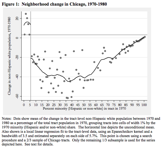
But while tipping makes for elegant theory, it’s less clear that it actually works to describe what happened—or is happening—in American cities. The first study to search for empirical evidence of tipping looked at how the racial composition of neighborhoods changed depending on its starting point—and found something that looked very much like Schelling’s tipping point:
This graph compares the percentage of a neighborhood’s population that was non-white in 1970 with racial change over the next decade. What you want to look at is the vertical line at about 5% minority in 1970. If there were no tipping point, you would expect the trend lines on either side of that vertical line to match up. Instead, they’re extremely far apart, suggesting that something happened when a neighborhood hit about 5% black and Hispanic that caused it to suddenly lose lots and lots of its white residents. In other words, a tipping point.
…and the evidence against tipping
But a follow-up study by William Easterly put some limitations on those findings. Instead of simply asking whether tipping points exist at all, it asked whether their results were as extreme as predicted by Schelling. Remember that in the original model, a small number of new black or Hispanic households could tip a neighborhood to being almost entirely black and Hispanic. That’s important for explaining American residential segregation, because many segregated neighborhoods do, in fact, have virtually no white residents.
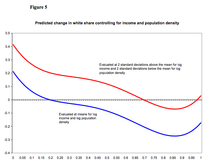
But that’s not what the Easterly study found. Instead, while most neighborhoods became less white between 1970 and 2000—which makes sense, since the country as a whole did, too—there was very little evidence of a tipping point that led to all-black and Hispanic communities. While racial change did take place, with about 10% of all neighborhoods switching from majority-white to majority-black or Hispanic over that time period, they didn’t follow the pattern predicted by Schelling.
For one, even nearly all-white neighborhoods—the ones on the far side of the “tipping point” that should be racially stable—became much less white over that time period. Even more surprising, neighborhoods where more than 75% of residents were black or Latino actually became whiter from 1970 to 2000. In a way, that makes sense, since we know that racial segregation is slowly declining; but it’s very confusing from a “tipping point” perspective, since even much smaller proportions of people of color are supposed to send white residents running.
So neighborhoods at the two extremes of segregation didn’t behave as predicted by the Schelling model. What about relatively integrated neighborhoods? According to tipping theory, these should be the least racially stable, quickly becoming dominated by one group or another. Instead, they were among the most stable: the typical neighborhood that was 50% white in 1970 changed less than neighborhoods that were 100% black or 100% white.
Why it matters
Now, there are important caveats to all this. This doesn’t at all contradict the large amounts of evidence that Americans, and especially white Americans, have pronounced racial preferences with regard to their neighbors, or that those preferences have major consequences. (Recall the Ed Glaeser and Jacob Vigdor study that explains lower property values in black neighborhoods, everything else being equal, by the artificial drop in demand that results from whites’ avoidance.) Also, because the available data only begins in 1970, we can’t totally rule out that something like the more extreme version of Schelling’s tipping point model actually did lead to segregation before 1970.
Still, in putting limits on Schelling’s model, Easterly’s study helps shine light on some of the dangers of relying too heavily on “tipping” to explain segregation. First, the tipping point model can be seductive because it tells a story about segregation in which there are no real villains: in a world with very mild racial preferences, it’s amazing “how easily segregation arises”—it’s “math”!
But we know that’s a very selective reading of the evidence. The historical record of racial segregation in American cities is clear, and there are lots of villains. They include the federal, state, and local governments, and the white voters that elected them; the realtors and bankers who enforced discriminatory real estate practices; and the many regular, everyday people who reacted to new black neighbors by throwing bricks or burning crosses, and the even greater number who failed to stand up to them.
But the fact that tipping points aren’t nearly as extreme as they’re often made out is also cause for optimism. Taken literally, the tipping point theory would lead to a pretty fatalistic view about the persistence of segregation: if only very small differences in preferences necessarily lead to widespread segregation, then it may be nearly impossible to make progress. In the wake of the Obama Administration’s announcement that it would be more aggressively pursuing the mandate to “affirmatively further fair housing” in the 1968 Fair Housing Act, many skeptical commenters suggested that any attempt to introduce racial or economic diversity in privileged white communities would turn those neighborhoods into “Detroit”—the country’s poster child for white flight.
That’s a theory that’s more than a little self-interested, since many of the people arguing it live in exactly the kinds of communities that have “benefited” from exclusionary practices for decades. Look, for instance, at the outcry in Westchester County, NY, when HUD suggested that some of the policies that had kept many of its towns so privileged, like a refusal to allow subsidized housing or multi-family buildings, ought to change. Or the people who stood up at a public meeting outside St. Louis to insist that, while they personally didn’t have anything against allowing lower-income black students from a nearby district coming to enjoy the high quality of their schools, other people would probably pick up and leave, and soon the whole district would be poor and black.
But its plausibility comes from the broad acceptance of something like the “tipping point” idea. Easterly’s study shows that the breakdown of one kind of segregation doesn’t automatically lead to segregation at the other extreme—and that’s a thin reed of hope that less divided, and less unequal, cities might be more realistic than we think.


