Our new CityReport dives deep in data; but what does a diverse, mixed income neighborhood look like?
As we explained in our new report–America’s Most Diverse, Mixed Income Neighborhoods–nearly seven million Americans live in one of the neighborhoods we’ve identified as America’s most racially and ethnically diverse and mixed income. While we’ve got copious amounts of data, and maps showing where these neighborhoods are located, what does a diverse, mixed income neighborhood look like at ground level?
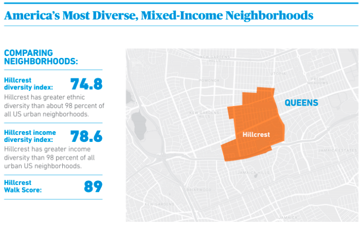
To answer that question, we’ve profiled a handful of the 1,300 neighborhoods nationally that scored highest on our two measures of integration: the racial and ethnic diversity index and the income diversity index. The neighborhoods selected score in the top 20 percent of all urban neighborhoods in the US on each of these measures.
One of these highly diverse, mixed income neighborhoods is Hillcrest, Queens, in New York City. (To see the full neighborhood profile in PDF format, click on this image).
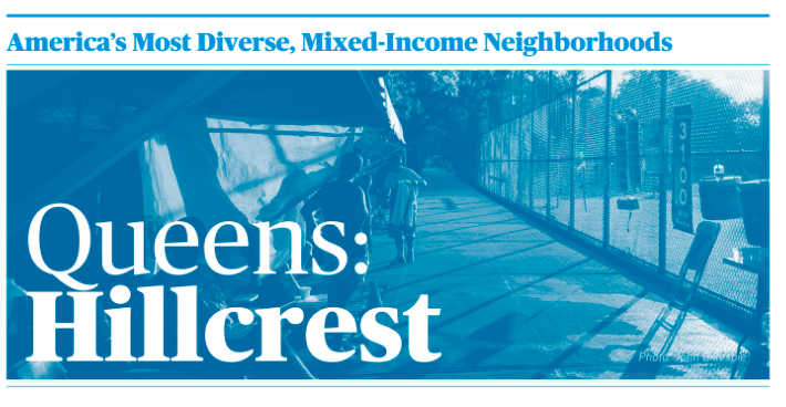
Hillcrest is located on a ridge between Jamaica and Flushing in Queens, and is adjacent to the campus of St. Johns University.
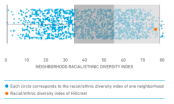
 To get a graphic idea of how diverse these neighborhoods are compared to other neighborhoods in the same metropolitan area, we’ve constructed a pair of box-whisker scatter diagrams that illustrate the pattern of income and racial ethnic diversity in each metropolitan area. In these diagrams, each dot represents a single neighborhood (census tract). The light and dark shaded rectangles correspond to the two middle quartiles of the income distribution: half of all neighborhoods fall into this range, and the midpoint between the two rectangles shows the median value for the metropolitan area. On this chart, the highlighted orange dot shows the racial and ethnic diversity of Hillcrest compared to all of the other neighborhoods in the New York metropolitan area.
We’ve compiled similar profiles of selected neighborhoods in other metropolitan areas around the country. For example, you can explore the demographics of the St. Mary’s Park neighborhood in San Francisco, the Near South Side in Chicago, and Corktown in Detroit. We’ve also prepared profiles of neighborhoods in Philadelphia, Memphis and Akron. (In the case of Memphis and Akron, the profiled neighborhoods don’t meet both our screening criteria, but do represent what are the most locally diverse neighborhoods, we’ve included these profiles to show what the most diverse neighborhoods look like in smaller metropolitan areas.
