A crazy toll structure that encourages more driving.
Kentucky and Indiana have just put the finishing touches on two new bridges crossing the Ohio River. Built at a cost of about $2.6 billion, the bridge project also includes a rebuilding “Spaghetti Junction” an elaborate system of on- and off-ramps in Louisville, where I-65 and I-64 intersect near the city’s downtown. An impressive set of aerial photos of the newly completed project proudly produced by the Louisville Courier-Journal set off a predictable chorus of derision in the urbanist community earlier in the week.
Photo: 8664.org
But there’s another feature of the new bridge project that we think may be even more egregious than the concrete pasta of the re-built interchange: the new tolling structure that will repay the cost of building the new bridges. On Friday, motorists crossing the Ohio River in Louisville will start paying tolls to help cover the costs of the two newly built bridges.
The bridges—and the tolls—are the culmination of a decades-long effort to expand highway capacity connecting Louisville with suburbs in southern Indiana. The project has a long and complex history–you can read Aaron Renn’s recounting here–but we can summarize it briefly as follows: Since the 1960s, Interstate 65 has been carried across the Ohio River on the six-lane Kennedy Bridge, which has been approaching capacity for some time. The region debated two alternatives for adding freeway capacity, a twinning of the Kennedy bridge near downtown and a second bridge, several miles to the East, which would complete a beltway around Louisville. After much conflict, Indiana and Kentucky compromised and decided to build both crossings (and nixed a plan–called “86-64“–to tear out the downtown freeway). The two states have just completed the new downtown Abraham Lincoln bridge adjacent to the Kennedy Bridge as well as the suburban East End Bridge. In addition, two other highway bridges also cross the Ohio River in the Louisville area: the I-64 Sherman Minton Bridge to the west and an older 2-lane Clark Memorial bridge downtown. As a result, the Louisville area now has five bridges crossing the Ohio.
I-65 Lincoln Bridge, Louisville (Flickr: StevenW)
The two states have had to set up a brand-new tolling system, because previously all these Louisville area crossings were toll free. Tolling will be all electronic, and barrier-free, and the bi-State RiverLink will use a combination of transponders and license plate readers to enforce tolls. Car owners that registered their license plates in advance and create a debit account will pay $3 per crossing; those who don’t register will be billed $4 per crossing. Motorist who buy transponders will pay $2 per crossing, but can qualify for a discount if they’re a regular user. But tolls will be charged only for the two Interstate 65 Bridges (the new Lincoln and the re-habbed Kennedy) and the new East End Bridge; the I-64 Minton Bridge and the downtown Clark Memorial bridge will continue to be free. So right off the bat, we have a strange mix of tolled bridges crossing the same river very near un-priced bridges. That’s likely to produce some interesting traffic patterns, as drivers re-route to avoid tolls.
Discounts for more driving
But here’s where things get very strange: As mentioned, there is a discount for regular commuters. To qualify for the toll discount, you have to have an account and a transponder, and take at least 40 trips across the river each calendar month. For your first 39 trips, you are charged $2 each, up to a total of $78. But when you take your 40th trip, you are given a $40 toll credit, and your total bill falls to $40 dollars for 40 trips ($1 per trip). And thereafter, you pay $1 per trip for the rest of the month. Louisville Courier-Journal reporter James Bruggers wrote about this odd feature of the tolling system early last year.
This produces some unusual incentives: Once you’ve taken 20 trips in a month (at a cost of $40), you can take 20 more trips essentially for free—provided of course you take all 20 before the end of the month. And if you’ve taken 25 or 30 trips, you’ll actually pay a financial penalty if you don’t get to 40 trips.
So what this is likely to mean, especially toward the end of the month, is that motorists will be driving across the bridges to make sure that they save money. It would be economically rational, for someone with 34 trips across the river on the 31st of the month to make sure that they did 3 or 4 laps across the river to make sure that they got their discount. Failing to do so would cost them $25 or more.
The folks at RiverLink have an interesting spin on this: They’re urging people to take extra trips across the river to make sure they qualify for the discount:
What if you’ve made, say, 38 trips in a calendar month? You’d pay $76. So you would want to consider taking at least two more trips across one of the bridges, perhaps for dinner or shopping. Then, the 40-crossing threshold would be met, taking your payment down to $40 for the month.
At City Observatory, we generally all in favor of road pricing. In theory, what tolls ought to do is send signals to motorists about whether, when and where to drive, leading them to make socially useful decisions. For example, peak hour pricing (charging steeper tolls during rush hour) gives motorists who can postpone trips a financial incentive to do so—freeing up capacity and saving travel time for those who really need or value traveling during the peak.
But since the proposed Louisville tolls don’t vary by time of day, you pay the same price whether you use one of the new bridges at the height of the rush hour, or in the wee hours of the morning when no one else is one the road. This flat-rate tolling structure misses a major opportunity to better manage demand and improve the overall functioning of the transportation system. Instead, what Louisville has is a toll structure that essentially pays motorists to take extra trips in order to qualify for a discount could easily lead to more congestion, more pollution and more wear and tear on cars and bridges. It is effectively paying motorists to waste time and fuel.
We’re sure that this is not the result that the Kentucky and Indiana DOTs had in mind when they designed the system. What they probably wanted to do was encourage motorists to self-select for the discount—only regular bridge users would sign up. But they’ve created an odd set of incentives to generate more peak period traffic on the bridge. What this will do—it’s pretty clear—is goose traffic counts on the bridges, especially toward the end of the month. But it won’t provide any more revenue.
From the standpoint of reducing congestion—the stated goal of the project—this toll structure makes little sense. The tolls seem designed primarily to give state officials the re-assuring talking point that tolls will cost regular commuters no more than a dollar a day. The big risk here is that the toll structure may undermine both the financial and traffic performance of this very expensive investment. The presence of nearby un-tolled bridges may prompt many users–especially occasional and off-peak travelers to avoid the tolls altogether, undercutting revenue. Meanwhile, regular travelers may both over-use and under-pay for use of the new bridges: there’s no difference in price between using the bridge 20 times and using it 40 times. In addition, providing cheap toll discounts for very regular commuters also promises to undercut the market for transit, and car-pooling.
The tolling of the Ohio River Bridges promises to be an interesting experiment in high finance and travel behavior. We’ll be watching to see what happens next.
Note: This post was revised on January 6 to change an image used in the story, and to add a reference to a press story addressing the incentive effects of the toll system.
City Observatory has its own modest proposals for making “Smart City” streets safer.
Sooner than many of us thought possible, self-driving cars are in testing on city streets around the country. While a central promise of autonomous vehicle backers has been that this technological advance would eliminate road carnage, there’ve been good reasons to be skeptical. Last week’s news that a self-driving Uber being tested on the streets of San Francisco had blown through a red light in front of a pedestrian in a marked cross walk, made that skepticism seem well-warranted. A video, taken from the dashboard camera of a taxi, shows the incident.
Fortunately, tragedy was averted in this case. But it shows just how prescient we’ve been at City Observatory. Back in May, we took note of some of the technological thinking being applied to the problem of pedestrian safety, and added some of our own ideas–complete with illustrations–to the discussion. Now seemed like a good time to dust off our drafts, and offer them up to Uber and the other firms ready to unleash their vehicles–permitted or not–on our city streets.
Our thinking was prompted by the release of patent drawings in May, in which Google unveiled plans for a novel plan to coat the exterior of self-driving cars with a special adhesive that would cause any pedestrians the vehicles struck to adhere to the car rather than being thrown by the impact. Whether it would be better to find oneself stuck to the car that struck you, rather than being pushed aside, is far from clear. But pedestrian safety in a world of self-driving cars is clearly an issue that needs to be dealt with.
Here at City Observatory, we’ve come up with our own concepts for, if you will, lessening the impact of autonomous cars on pedestrians. In the interest of safety and advancing the state of the art, we’re putting our ideas into the public domain, and not patenting any of them.
Pedestrian Shock Bracelets. Most pedestrians are already instrumented, thanks to cell phones, and a large fraction of pedestrians have fit-bits, apple watches and other wearable, Internet-connected devices. We propose adding a small electroshock device to these wearables, and making it accessible to the telematics in autonomous vehicles. In the event that the autonomous vehicle’s computer detected likelihood of a car-pedestrian collision, it could activate the electroshock device to alert the pedestrian to, say, not step off the curb into the path of an oncoming vehicle.
Personal airbags. Airbags are now a highly developed and well-understood technology. Most new cars have a suite of frontal impact, side curtain and auxiliary airbags to insulate vehicle passengers from collisions. The next frontier is to deploy this technology on people, with personal airbags. Personal airbags could have their own sensors, inflating automatically when the pedestrian was in imminent danger of being struck by a vehicle.
Rocket Packs. While a sufficiently strong adhesive might keep a struck pedestrian from flying through an intersection and being further injured, perhaps a better solution would be to entirely avoid the collision in the first place by lifting the pedestrian out of the way of the collision in the first place. If pedestrians were required to wear small but powerful rocket packs, again connected to self-driving cars via the Internet, in the event of an imminent collision, the rocket pack could fire and lift the pedestrian free of the oncoming vehicle.
We offer these ideas partly in jest, but mostly to underscore the deep biases we have in thinking about how to adapt our world for new technology.
It has long been the case with private vehicle travel that we’ve demoted walking to a second class form of transportation. The advent of cars led us to literally re-write the laws around the “right of way” in public streets, facilitating car traffic, and discouraging and in some cases criminalizing walking. We’ve widened roads, installed beg buttons, and banned “jaywalking,” to move cars faster, but in the process making the most common and human way of travel more difficult and burdensome, and make cities less functional.
Everywhere we’ve optimized the environment and systems for the functioning of vehicle traffic, we’ve made places less safe and less desirable for humans who are not encapsulated in vehicles. A similar danger exists with this kind of thinking when it comes to autonomous vehicles; a world that works well for them may not be a place that works well for people.
Consider this recent “Drivewave” proposal from MIT Labs and others to eliminate traffic signals and use computers to regulate the flow of traffic on surface streets. The goal is to allow vehicles to never stop at intersections, but instead travel in packs that create openings in traffic on cross streets that allowed crossing traffic to flow through without delay. Think of two files of a college marching band crossing through one another one a football field.
It’s thoroughly possible to construct a computer simulation of how cars might be regulated to enable this seamless, stop-free version of traffic flow. But this worldview gives little thought to pedestrians—the video illustrating drivewave doesn’t show any pedestrians, although the project description implies they might have access to a new form of beg button to part traffic flows to enable crossing the street. That might be technically feasible, but as CityLab’s Eric Jaffe pointed out, “it would be a huge mistake for cities to undo all the progress being made on human-scale street design just to accommodate a perfect algorithm of car movement.”
Not all of our problems can be solved with better technology. At some point, we need to make better choices and design better places, even if it means not remaking our environment and our communities to accommodate the more efficient functioning of technology.
Thanks to Matt Cortright for providing the diagrams for our proposed pedestrian protection devices.
At the top of most housing activist wish-lists is the idea that cities should adopt inclusionary housing requirements: when developers build new housing, they ought to be required to set-aside some portion of the units–say 10 or 20 percent–for low or moderate income families. Dozens of cities around the country have adopted some variant of the inclusionary idea.
Portland’s City Council is weighing adoption of an inclusionary housing requirement that would be among the nation’s most stringent: it would require all multi-family developments of 20 or more units to set aside 20 percent of newly constructed apartments for families earning no more than 80 percent of the region’s median household income. Unlike inclusionary zoning programs in many other cities, like New York and Chicago, which apply only when a developer is seeking an up-zoning or has some form of public subsidy, Portland’s ordinance would apply to virtually all development, including that that only seeks to build at density levels already authorized by the zoning code.
One of the principal arguments advanced by proponents of the ordinance is the policy wonk version of the “all the other kids are doing it,” refrain well known to parents everywhere. For example, in testimony to the Portland City Council on December 13, Professor George Galster assured the city council that inclusionary zoning was a well-established practice, in use widely around the country for more than forty years, concluding:
. . . they are in operation in hundreds of cities and counties across the United States, including fast-growing Portland-sized places like Denver and Minneapolis.
(Portland City Council Video, December 13, 2016 (at 56:30)
In a narrow statistical sense, that statement is mostly true: lots of places have adopted something they call “inclusionary zoning” or “inclusionary housing.” But that appellation is applied to a wide range of programs, most of them tiny or toothless. As we’ve reported at City Observatory, there’s less to most inclusionary zoning programs than meets the eye: While impressive sounding on paper (and perhaps in the press) they tend to produce very few units of new housing, typically due to the limited scope and discretionary application.
And in the case of Denver and Minneapolis, the two instances specifically cited by Dr. Galster, there’s even less that meets the eye. Minneapolis does not in fact have an inclusionary housing requirement, although it does have a voluntary density bonus for developments that include affordable housing (which no developer has apparently ever used). And, as of September, Denver has repealed its inclusionary housing requirement. Section 27-105(a) of the city’s development code had required some new developments of 20 or more units to set aside 10 percent of newly added units for households with less than 80 percent of the area’s median income. That requirement is repealed effective January 1. (For what its worth, as we reported at City Observatory earlier, the Denver program had produced a paltry 77 units since it was established in 2002). Here’s the pertinent City of Denver Ordinance:
In its place, Denver has adopted a new Permanent Housing Trust Fund, which will provide an estimated $15 million per year for the next decade to help acquire and rehabilitate low and moderate income housing. The fund will get revenue from a city-wide property tax as well as “linkage fees” on a wide variety of new development projects, including residential and commercial development. This approach was designed explicitly to spread the burden of subsidizing housing as widely as possible and avoiding creating disincentives to new residential development. And for those who think Portland is somehow lagging Denver in promoting housing affordability, Portland’s recently approved housing bond of $258 million, is actually larger than Denver’s new fund.
As a legal and policy matter, a wide variety of ordinances and programs clothe themselves in the appealing term “inclusionary housing.” But here especially, the devil is in the details. Even Mayor Bill de Blasio’s vaunted “Mandatory Inclusionary Housing” requirements apply only if developers seek up-zoning.
Here’s why this matters: Advocates are arguing that the experience of all these other places shows that inclusionary requirements have no negative effects on new privately financed housing construction. But if the programs in New York, Chicago, Denver and Minneapolis are so much smaller, are voluntary, have been repealed or simply don’t exist, then they provide no evidence that the program being proposed in Portland will not greatly reduce new housing construction–and thereby exacerbate the city’s housing shortage, and actually worsen rent inflation.
When advocates sweep these substantive policy differences under the rug, and don’t acknowledge the limited scope of real-world inclusionary programs–as well as significant back-sliding from inclusionary zoning, as in Denver, they’re mis-informing policy makers. As we pointed out earlier this month, the scope of the Portland program is much broader than virtually every other extant inclusionary zoning program and is highly likely to have a devastating effect on new housing construction. Ultimately, details matter, and sweeping claims that elide the great variation in policies that carry the appellation “inclusionary” is misleading; no better than an eight year-old claiming that “all the other kids do”–when in fact they don’t.
1. A rebound in millennial car-buying?. Stories purporting to debunk the tendency of younger adults to move to cities, buy fewer houses and drive less seem to have great appeal to editors everywhere. We look into recent reports claiming that ride-sharing millennials crave car ownership after all. A recent Federal Reserve Bank study shows that new car purchases for young adults are still depressed from pre-recession levels and that the only group buying more cars is aging baby boomers. The decline in car purchasing among young adults seems to be closely related to their reduced economic prospects and their lower and later rate of marriage, compared to previous generations.
2. Some timely technologies to help pedestrians cope with self-driving cars. A number of companies are moving forward aggressively to test self-driving cars–perhaps too aggressively. In California, Uber has gotten into hot water (yet again) with local regulators over operating self-driving cars without legal permission. One self-driving Volvo was photographed running a red-light in San Francisco, just in front of a pedestrian in a marked crosswalk. The prospect of pedestrian-self-driving car conflicts seems inevitable, which has led Google to patent a special adhesive car hood to keep pedestrians from flying off if their struck. We’ve added our own ideas about how technology might keep pedestrians safer.
3. Denver backs away from inclusionary zoning. One of the favorite arguments of proponents of inclusionary zoning is a wonky variant of the child’s plea that “all the kids are doing it.” Several hundred cities and counties have developed some kind of inclusionary housing policy. But beyond the word “inclusionary” there’s often little these policies have in common with the specific proposals the cities are being asked to adopt. Case-in-point: Portland is being asked to implement one of the nation’s most stringent inclusionary zoning requirements, with advocates assuring the City Council that it need not fear adverse effects on housing supply predicted by developers, because other cities similar to Portland have inclusionary housing programs that work. Of two cited exemplars–Denver and Minneapolis–the first has just repealed its inclusionary zoning requirement, and then second has never had one. So rather than following a well-trod path, Portland is blazing un-charted and risky territory.
Must Read
This week we have three longer and more searching explorations of big urban issues–traffic congestion, smart cities and regional development–that reach beyond the daily, data-driven viewpoint to re-consider first principles. They come from three of our favorite authors, and make great reading as we wrap up one year and proceed to the next.
How to think about traffic congestion. Felix Salmon, who you may know from his stint at Reuters and more recently with Fusion, has a new newsletter–”Nota Bene“–offering up his trenchant thoughts on a wide range of subjects, from wine to lead poisoning. Right off the bat, Salmon has a compelling essay addressing how we think about traffic congestion. Salmon argues that our perennial dissatisfaction with traffic congestion is largely a product of unrealistic expectations: “the answer to pretty much all traffic problems, it seems to me, is best addressed neither on the supply side nor on the demand side, but rather on the expectations side.”(While this article is well worth a read on its own merits, you’d be well-advised to subscribe to Nota Bene and get a weekly dose of Felix Salmon’s keen wit.)
Traffic in New Orleans. What were you expecting? Credit: Bart Everson, Flickr
Another take on “Smart Cities.” The University of Minnesota’s David Levinson–aka “The Transportist”–offers his views on Smart Cities. The fatal conceit of the Smart Cities evangelists, in Levinson’s view, is the assumption that the single central planner knows what’s best. The advent of big data fuels the illusion that planners can know so much more than they do now, and know it in real time, in a way that will enable them to overcome the limits that plague traditional centralized decision-making. Levinson argues that this is a mirage: that the knowledge required is so complex, and balancing competing interests and priorities so difficult, that we’d be much better off with a much more decentralized system, that gave individual actors more autonomy and used prices to reflect back to users the costs and consequences of their choices.
Regional Policy and Distributional Policy in a World Where People Want to Ignore the Value and Contribution of Knowledge- and Network-Based Increasing Returns. In the wake of the November election, there’s a lot of soul searching among liberals asking whether we’ve done enough to address the economic dislocation produced by globalization and technological change. Donald Trump clearly tapped a deep vein of resentment among those who’ve seen traditional routes to success, including the emblematic blue-collar manufacturing jobs go into prolonged decline. That’s prompted a renewed interest in how we might extend economic development to depressed areas and dislocated workers. Berkeley economist Brad DeLong traces the roots of this problem to our collective failure to come up with ways that provide for an equitable distribution of the fruits of our collective endeavors while maintaining the shared belief that each of us is getting what we’ve earned and deserve. It’s a provocative piece, and one that frames many of the fundamental issues that underly the national debate about regional development.
New Knowledge
The Flattening of the College-Wage Premium. One of the key markers of a shift to a globalized, knowledge-driven economy has been the increasing premium that college-educated workers have earned relative to those with just a high school education. A new paper from Federal Reserve Bank of San Francisco economist Robert Valetta looks at recent trends in the wage premium. He finds that after growing sharply in the 1980s, growth in the wage premium slowed in the 1990s, slowed further in the last decade, and has been essentially un-changed since 2010.
Valetta considers two alternative explanations for the non-growth of the wage premium in recent years: job polarization and skill down-grading. The first posits that the number of middle-wage jobs have eroded, while the second implies that a relative glut of well-educated workers is pushing college-educated workers into jobs that have been usually held by workers with less education, dampening the returns to education. The takeaway: “These patterns suggest that the previously growing complementarity between highly educated labor and new production technologies, especially those that rely on computers and related organizational capital, may be leveling off. ”
1. The illegal city of Somerville. Just outside of Cambridge, Massachusetts, Somerville is one of the most sought after suburbs in the Boston area. It has a combination of attractive neighborhoods and dense housing, nearly all of it the legacy of the city’s 19th and early 20th century roots. But a recent analysis by city planners shows that current planning requirements and zoning restrictions (including height limits, building set-back requirements and similar regulations) would make it simply illegal to rebuild about 99 percent of the city’s current building stock. Just 22 extant residential buildings in a city of 80,000 fully comply with existing requirements. The mismatch between what people increasingly desire and what the law allows suggests some very deep-seated problems with our approach to zoning.
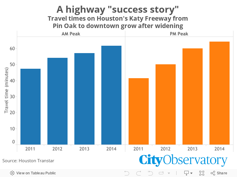
2. Reducing congestion: Katy didn’t. Houston’s Katy freeway is the nation’s (and possibly the world’s) largest, measuring 23 lanes wide. It was recently expanded with an eye to easing road congestion. But it turns out that even 23 lanes isn’t enough: travel times on major stretches of the freeway are even longer now than they were before it was widened. And here’s the kicker: highway advocates like the American Association of State Highway and Transportation Officials (AASHTO) actually tout the Katy as a congestion-fighting success story.
3. For whom the bridge tolls. Louisville is opening up a pair of new bridges across the Ohio River, and to pay for them, it has devised a novel tolling scheme. Unfortunately, the convoluted discount system that they’ve implemented creates some peculiar incentives, effectively paying drivers to take more trips. While road pricing ought to be a way to align private incentives with social goods, both helping to pay for transport infrastructure and encouraging people to use it wisely, this system does the opposite.
4. Our ten most popular posts of 2016. To wrap up the old year, we provide a top ten list of the City Observatory commentaries that generated the most interest in 2016. We described how most American cities are burdened with a sprawl tax costing in the billions; we observed the inherent contradiction between our widely accepted policy goals that housing ought to be affordable and also provide terrific investment returns. We reflected on the deep urban planning lessons (and biases) built into “Sim City.”
Happy New Year
Our regular features–Must Read and New Research–will return next week. Until then, we wish you a Happy New Year.
1. Urban transportation’s camel problem. Naive optimism is the order of the day in speculating about the future of urban transportation. In theory, some combination of autonomous vehicles, fully instrumented city streets, and transportation network companies will help us solve all of our problems, from congestion to traffic fatalities to parking to accessibility for all. As Jarrett Walker has pointed out, these simplistic versions of a technological fix overlook a fundamental geometry problem in the capacity of city streets. To which we add what we call the “camel” problem. Demand for transportation isn’t smooth and even, its a two-humped camel, as most of our demand for movement occurs in a few morning and evening peak hours. Designing a technology to cope with camel-shaped transportation demand will be a big challenge for future technology.
Standing in the way of urban transportation reform (Flickr: Adair Broughton)
2. Copenhagen: More than bike lanes. Copenhagen is a kind of cycling nirvana: just recently, the number of trips taken by bicycle exceeded car trips in that Danish city. Many Americans have made pilgrimages there, coming back with dreams of turning their cities into similarly bike-friendly environments. A recent story in the Guardian highlights what’s most obvious to visitors about the city’s success: they’ve built lots of bike lanes and city leaders are strong supporters of cycling. Those factors are both important, but this infrastructure plus leadership narrative leaves out an important set of facts about Danish tax policy. In Denmark, unlike the US, cars are expected to shoulder much more fiscal responsibility. Danes pay a 150 percent excise tax for new cars (more than doubling the cost of car ownership) and pay nearly $6.00 gallon for gas. Getting the prices right, as well as providing the infrastructure, are the secrets to this Danish cycling recipe.
She’s in the majority. (Flickr: Colville-Anderson)
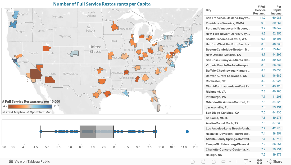
3. You are where you eat. One of the hallmarks of a great city is a smorgasbord of great places to eat. Cities offer a wide variety of choices of what, where, and how to eat, everything from grabbing a dollar taco to seven courses of artisanally curated locally raised products (not to mention pedigreed chickens). The “food scene” is an important component of the urban experience. We quantify the foodie question in typical City Observatory fashion, reporting the number of restaurants per capita in each of the nation’s large metropolitan areas.
4. Peer effects: Help with homework edition. There’s a growing body of evidence showing that your neighbors and your neighborhood have a huge impact on our life prospects. Concentrated poverty amplifies all the negative problems of growing up poor because you attend schools with fewer resources, weaker parental and community support, and thinner social networks. A new study points up a subtle, second-order problem associated with poor neighborhoods. Parents decide how much effort to invest in helping their kids study (helping with homework, seeking tutoring, pursuing other learning activities) based on how well they think their kids are doing in school. In poorer neighborhoods with generally lower-performing schools, parents compare their children to peers who may be performing below average, leading them to mistakenly conclude that their children are performing well academically, and leading them to under-invest (their time and energy) in promoting academic performance.
Must Read
1. The cure for costly housing is more costly housing. Bloomberg columnist Noah Smith perplexes his non-economist friends in San Francisco with the highly counter-intuitive claim that the solution to the city’s exploding affordability crisis is building even greater numbers of expensive homes. It’s an article of faith among housing activists in that city, and elsewhere, that the only just solution for housing affordability is building more deeply subsidized apartments. For Smith–as for us–the problem boils down to demand and supply: the demand for opportunities to give in great urban spaces (like San Francisco) has grown much faster than the supply of housing there, and given a shortage, higher income residents can out-bid middle- and lower-income residents for market housing. The only solution is to expand supply, and the fragmentary evidence from San Francisco is that the modest increase in construction achieved in the past few years has already had the effect of moderating rent increases. The nation’s housing affordability problems are a teachable moment for economists, and in his usually thoughtful and dis-arming way, Smith has shown how this works.
Credit: David Yu, Flickr
2. Rents are falling in New York City. Meanwhile, from his perch on the East Coast, Slate’s Henry Grabar offers up a small, but growing collection of anecdotes about declining rents in New York City. Increasingly, developers are offering prospective renters concessions (usually a month or two of free rent), and for some units, prices are actually lower now than a year or two ago. One source estimates that more than a quarter of new apartments are offering concessions. Grabar thinks this may be the harbinger of further easing in rental rates, as tens of thousands of new apartments are in the construction pipeline in New York. As they come on the market, landlords will be forced to offer better deals to land tenants. The evidence here is still partial and preliminary, and even though it doesn’t signal a reversal of the rent hikes seen in the past five years, it does show that as supply catches up to demand, price increases abate.
New Knowledge
1. The 2011-15 five year ACS data. For data geeks, Christmas comes fairly early in December. This year it fell on December 8th, the date that the Census Bureau released its tabulation of the five-year 2011-15 American Community Survey. The ACS is our primary tool for understanding key changes in demographics, household well-being, housing and a wide range of other subjects. The Census aggregates five years of data to produce geographically fine-grained estimates of population and housing characteristics. You can learn more at the Census website, and can download data for particular geographies using American Fact Finder. Already, scholars and statisticians are beavering away at the new data: expect all manner of new studies and pronouncements based on this treasure trove. And remember one other thing: the ACS is a tangible and quite valuable product that is produced courtesy of the federal government and your tax dollars. Without the ACS–and there are real threats to is continuing existence–our nation would be flying blind when it comes to many important trends and issues. So be sure to use it, and if you find it valuable, let your elected representatives know.
2. America’s metropolitan neighborhoods are becoming more diverse–gradually. One of the first sets of findings from just released ACS data is an examination of the racial and ethnic composition of US neighborhoods and metropolitan areas by the Brookings Institution’s Bill Frey. In the aggregate, US metropolitan areas are growing steadily more diverse: Among the 100 largest metro areas, the share of the population that was non-Hispanic white declined from 64 percent in 2000 to 56 percent in 2011-15. Latinos increased from 15 percent to 20 percent of metro residents, and Asians from 5 percent to 7 percent. Blacks were about 14 percent of metro residents in both years. The typical white resident lives in a neighborhood that is less diverse than the overall metropolitan area. Even so, the typical white resident now lives in a neighborhood that is noticeably more diverse than it was in 2000. Among the 100 largest metro areas, the typical white resident lived in a neighborhood that was 79 percent white in 2000 and about 72 percent white today. Frey’s article in the Brookings blog “The Avenue” has data for the 100 largest US metro areas.
There’s a large a growing body of research that shows the importance of peer effects on lifetime economic success of kids. For example, while the education level your parents is a strong determinant of your level of education, it turns out that the education level of your neighbors is nearly half as strong. Much of this effect has to do with the level of resources and performance level of local schools: people who live in neighborhoods with lots of well-educated people have schools with more resources and stronger parental support. And there’s also a fair argument that a better educated peer group provides access to social networks and role models that shape aspirations and opportunities.
A new University of Chicago working paper from Josh Kinsler and Ronni Pavan underscores another, more subtle way that peer effects operate in schools. It’s titled: “Parental Beliefs and Investment in Children: The Distortionary Impact of Schools.” We know that one critical factor in explaining student achievement is what education scholars call “parental investment.” By this they mean the amount of time (rather than money) that parents dedicate to helping advance their child’s learning by, for example, helping with homework, or participating in school activities, or arranging tutoring or extra-curricular learning opportunities.
The study uses data from a national longitudinal survey covering Kindergarten, First- and Third-Grade students, and looks at the connection between parental beliefs about student performance generally, and in math and reading, and how this the amount of time parents spend helping children do homework and similar activities.
Kinsler and Pavan find that there’s a strong correlation between parental beliefs about their child’s relative performance and their investment in these kinds of time intensive learning activities. Parents who think their children are at or above the average, tend to invest less time in doing things like helping with homework. And there’s the critical part of their finding: parents tend to base their assessment of their child’s performance relative to other students in his or her class or school, rather than other schools, or the state or nation as a whole. This is mostly unsurprising: parents are going to get most of their information about academic performance by comparing their child to his or her classmates.
But the effect of this “local bias” in comparisons is that parents of students attending low performing schools will tend to have an inflated assessment of how well their child is doing–relative to all other students. This over-optimism will lead them to under invest in helping with homework, and doing other things to enrich their child’s educational opportunities. Its well-understood that low-income and single-parent households already start off with more limited time and resources to help support their children’s education. What this suggests is that given all the competing demands for their time and attention, they may be lulled into a false sense that their children are doing “well-enough” in school. As Kinsler and Pavan conclude:
Parents of low skill children who attend schools where average skill is also low will perform fewer remedial type investments than parents of similarly able children who attend schools where average skill is higher. Because of the tendency for students and families to sort into schools and neighborhoods, low skill children are more likely to attend schools where average skill is also low. As a result, the distortion in parental beliefs generated by local skill comparisons leads to underinvestment for low skill children.
As a result, one of the subtle and pernicious ways that economic segregation and the concentration poverty influence children’s lifetime incomes is by giving parents (and probably children) too limited a basis for measuring their performance and lead them to under-invest in educational skills.
The Big Idea: Many metro areas vie for the title of “best food city.” But what cities have the most options for grabbing a bite to eat — and what does that say about where you live?
There are plenty of competing rankings for best food cities floating around the internet. You can find lists for cities with the most restaurants, the best restaurants, the most distinctive local restaurants… and of course none of these seem to agree (although the “winners” tend to be similar among these lists).
But what about the cities that provide the most dining options per person? And what does restaurant variety have to do with a city’s livability?
One of the hallmarks of a great city is a smorgasbord of great places to eat. Cities offer a wide variety of choices of what, where, and how to eat, everything from grabbing a dollar taco to seven courses of artisanally curated locally raised products (not to mention pedigreed chickens). The “food scene” is an important component of the urban experience.
Restaurants are an important marker of the amenities that characterize attractive urban environments. Ed Glaeser and his colleagues found that “Cities with more restaurant and live performance theaters per capita have grown more quickly over the past 20 years both in the U.S. and in France.”
Matthew Holian and Matthew Kahn have seen that an increase in the number of restaurants per capita in a downtown area has a statistically significant effect in reducing driving and lowering greenhouse gas production.
We’ve assembled data on the number of full service restaurants per capita in each of the nation’s largest metropolitan areas. These data are from the County Business Patterns data compiled by the US Census Bureau for 2012. Note that the “full service” definition basically applies only to sit down, table service restaurants, not the broader category that includes fast food and self-service. We’re also looking at metro-wide data to assure that the geographical units we’re comparing are defined in a similar fashion—political boundaries like city limits and county lines are arbitrary and vary widely from place to place, making them a poor basis for constructing this kind of comparison.
As you might guess, the metro areas with the most restaurants per capita are found predominantly in the Northeast and on the West Coast. Elsewhere, New Orleans and Denver score high as well. While the average metropolitan area has about seven full-service restaurants per 10,000 residents, the range is considerable. The San Francisco metropolitan area has more than 11 restaurants per 10,000, while Riverside has only five and seven other metropolitan areas have fewer than six.
The top five metropolitan areas on this indicator are San Francisco, Providence, Portland, New York, and Seattle. Each of these cities has nine or more full service restaurants per capita. With the possible exception of Providence, all of these are recognized as major food cities in the US. (And Portland achieves its high ranking without counting the city’s more than 500 licensed food carts.)
Interestingly, Las Vegas, which we think of as a tourism mecca, has fewer restaurants per capita than the average metropolitan area. A lot of this has to do with scale—the average restaurant in Las Vegas tends to be much larger than in other metropolitan areas. According to the Census Bureau, almost eight percent of Las Vegas restaurants employed more than 100 workers; nationally the average is only two percent.
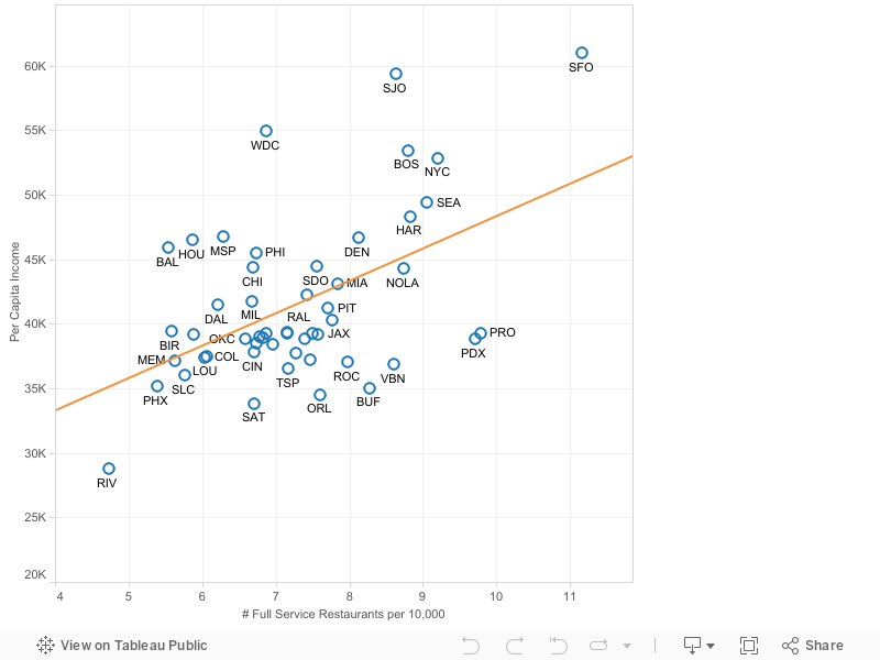
This ranking doesn’t include anything about quality–simply quantity– but the higher restaurants per capita can indicate higher competition (and therefore better quality options), or higher demand (a signal that more diversity of options is valued, allowing for more valuable experiences). It is also highly correlated with per capita income, which makes sense: the more people that are able to afford frequent restaurant outings, the more restaurants there will be.
While this isn’t a perfect listing of best food culture — each person’s measure of the ‘best food town’ is subjective — it does settle the debate of where you should go to have the largest selection of eatery options. If you’re going to travel 2,000 miles for dinner, it might be wise to make a reservation. Or if you’re going to Portland, at least be ready to wait in line.
There’s a lot of glib talk about how technology–ranging from ride-hailing services like Uber and Lyft, to instrumented Smart Cities and, ultimately, autonomous vehicles–will fundamentally reshape urban transportation. We’re told, for example, that autonomous vehicles will eliminate traffic fatalities, obviate the need for parking lots, and solve transit’s “last mile” problem. But there are good reasons to be skeptical.
As Jarrett Walker has famously pronounced, these would-be alternatives have a geometry problem. Solutions that rely upon trying to put more travelers in lots of smaller, often single-occupancy vehicles will inevitably run out of space in urban environments. In Walker’s view, the space efficiency of mass transit–city buses and rail lines–makes them the only feasible way of moving large numbers of people into, out of, and around big cities.
So a bus with 4o people on it today is blown apart into, what, little driverless vans with an average of two each, a 20-fold increase in the number of vehicles? It doesn’t matter if they’re electric or driverless. Where will they all fit in the urban street? And when they take over, what room will be left for wider sidewalks, bike lanes, pocket parks, or indeed anything but a vast river of vehicles?
No amount of technology can overcome the limits imposed by simple geometry.
There’s a lot of merit to this view. And too little thought has been given to how technological solutions might actually scale in actual urban environments. Even in New York City, with very sophisticated instrumentation of the taxi fleet and copious reports of activity from Uber and Lyft, there’s actually no comprehensive assessment of how the growth of these services has affected travel times and congestion, according to Charles Komanoff.
While the geometry problem is real, and under-appreciated, we think these new technological solutions will have to simultaneously face another problem, which we call the “camel problem.” The demand for urban transportation is not simple and linear. Walker’s geometry point is that demand for transportation has an important spatial component. To that we would add that it also has a temporal (time-based) component as well, one that’s well illustrated by our friend, below:
Standing in the way of urban transportation reform (Flickr: Adair Broughton)
Like the famous Bactrian camel, urban travel demand has has two humps. There’s a peak travel hour in the morning and a second one in the evening in virtually every large city in the US (and most places around the world). It seems to be a regular systemic feature of human activity: we sleep and eat in one set of places, and work, study, shop, and socialize in a different set of places, and disproportionately tend to make trips between these sets of places at the same hours of the day. There’s an abundance of data on this point. Transportation scholars (Tony Downs’ Still Stuck in Traffic is the definitive guide) and traffic engineering text books have documented it for decades. We observed it by pointing a Placemeter camera outside the window of City Observatory’s offices. And the latest bit of evidence for the “camel” view of transportation comes from New York City’s bike share program. Our friends at New York City Economic Development Corporation have an excellent report summarizing some of the trip data from the CitiBike program, showing, among other things the average age of riders (skewing towards young adults), and the most frequent routes traveled (more scenic routes along the West Side, and places not well-served by subways, among others). But the most interesting chart shows when people are riding CitiBikes, by hour of the day. It’s a camel, too:
The CITIbike Camel.
Just as with other modes of transportation (whether it’s the subway, city streets and bridges, or the bus system), travel exhibits two distinct peaks, one corresponding to the morning travel period, and a second in the late afternoon. About twice as many bikes are in use in the morning and afternoon peak hours as in the middle of the day.
The “camel” of urban transportation demand has important implications for designing and operating any new system of getting around cities. For example, a fleet of self-driving cars sized to meet peak hour demand would be more than 50 percent idle during most of the day. Except for an hour or two in the morning and perhaps two to three hours in the late afternoon, most vehicles would be idle.
While we think that there is merit to both the Jarrett Walker “geometry problem” and our own “camel problem,” it’s actually the case that the camel problem trumps geometry. The urban transportation system doesn’t have a geometry problem at 2AM, or indeed most of the day. The geometry problem becomes a problem chiefly in peak hours. Walker is almost certainly correct that geometry will guarantee that solutions like fleets of self-driving cars will never have the capacity to handle traffic loads–during peak hours. But the off-peak hours are a different situation. It seems almost certain that operators of fleets of self-driving cars will use surge-pricing to manage demand (and reap profits) associated with peak hour travel. The competitive challenge for transit is likely to be that fleets of self-driving cars will have abundant capacity during off-peak hours, and they will likely be tempted to offer discounted fares for vehicles that might otherwise be idle (and would probably also cross-subsidize the cost of these trips from profits earned at the peak). As we reported earlier, the best current estimates suggest that self-driving vehicles may cost an average of 30 to 40 cents per mile to operate. It seems likely that the price charged may be higher at the peak, but then discounted from that amount for off-peak hours. That’s a price point that many transit operators would be hard pressed to match.
It’s tempting to visualize alternatives to current transportation systems as a one-traveler or one vehicle-at-a-time problem. But the urban transportation problem is not so much about individual vehicles and trips, as the way trips cumulate in both space and time. The problem is complex one, and will defy simple solutions. Geometry–and camels–will be with us for the foreseeable future.
1. Pollution and poor neighborhoods. Environmental justice advocates point out–quite correctly–that poor neighborhoods tend to suffer much higher levels of pollution than the typical neighborhood. While this is often due to the callous indifference of public officials to the plight of the poor and people of color (as well as the powerlessness of these groups), other factors are at work as well. Those with the means to do so generally avoid polluted locations, leaving only those too poor to afford to live elsewhere stuck in the most polluted places. The tendency to move away from pollution if you can do so, creates a self-sustaining dynamic that drives long term poverty. Two new research studies show how long-lived these processes are, tracing the location of today’s high poverty neighborhoods to places that had the highest levels of air pollution in Victorian England, and a similar pattern for the low-lying marshy areas of Manhattan, which were long regarded as un-healthy.
Hazardous to your health, and neighborhood (Flickr: Otodo)
2. Are the ‘burbs bouncing back? An article in last week’s Wall Street Journal–“Suburbs outstrip cities in population growth” offered up the seemingly contrarian claims that suburbs are now outperforming cities, are nearly or more attractive to young adults, and as diverse as cities. The article is based on a report issued by the Urban Land Institute on December 5. We take a close look at the ULI report’s novel method of defining neighborhoods as urban or suburban. While its a thoughtful attempt to take a more nuanced view of the urban-suburban continuum, we think it fails as a basis for making sweeping claims about national trends because it effectively grades on a curve–using different numerical thresholds to classify areas as urban or suburban in different metropolitan areas. We think that there are also good reasons to be skeptical of its specific claims about city growth; its headline findings rest on 15-year data which combines the housing bubble with a very different period since then. Bottom line: Cities have outgrown suburbs in recent years, are attracting a disproportionate share of young adults, and are more diverse than suburbs.
3. Finally, an anti-poverty policy that works. Its long been argued that minimum wages aren’t effective in fighting poverty because they lead employers to reduce the number of hours of paid work or hire fewer workers. The recent adoption by 18 states of higher minimum wages provides a kind of natural experiment for testing that theory. A new paper from the President’s Council of Economic Advisers shows that in the states with higher minimum wages, average earnings for workers in food service and accomodation industry’s increased significantly, while employment levels showed no decline from previous rates.
4. Some thoughts on Portland’s proposed inclusionary housing policy. Portland is considering adopting an inclusionary housing requirement that would require most new apartment developments with more than 20 units to set aside 20 percent of their units for households earning no more than about $58,000 per year. While advocates of the policy have assured the City Council that such requirements are commonplace, the proposed Portland policy differs from that in other jurisdictions in that its scope is much wider. In cities like Chicago and New York, only developers seeking to up-zone their properties or who are getting some public subsidy typically are required to meet inclusionary requirements. Portland’s much more stringent policy is likely to backfire–leading many developers to drop out of the Portland market, aggravating the city’s housing supply problems, and leading to higher rents–for everyone.
Must Read
1. Is rental affordability a symptom of poverty or gentrification? The University of Minnesota’s Myron Orfield and Will Stancil are some of the most thoughtful and relentless scholars investigating race, poverty and segregation. In an op-ed in the Minneapolis Star Tribune, they take on the claim that the increase in rental affordability problems in the Twin cities is being caused by gentrification. Earlier press coverage pointed to declining affordability, as measured by the number of households paying more than 30 percent of their income for housing (a standard which we regard as problematic). Journalists and local elected officials were quick to blame gentrification, with one city council member saying she could “feel” the gentrification. Orfield and Stancil push back, pointing out that the decline in affordability has more to do with a 44 percent decline in typical black household incomes than it does with a 3 percent increase in rents. The real problem, they argue, is the persistence and continuing growth of neighborhoods of concentrated poverty.
2. Black flight to suburbs and segregation in Detroit. The Center for Michigan has a powerful new report looking at decades of neighborhood change in the Detroit metropolitan area. It begins by recounting the tale of white suburban flight from the city of Detroit, and illustrating how segregated the city (and region) had become by 1970. It then uses census data to track population growth since then. Like whites before them, the region’s black population has increasingly suburbanized, but its done so in a way that has mostly recapitulated the earlier pattern of segregation at a larger scale. Even though many formerly predominantly white suburbs now have black residents, they tend to be disproportionately found in a few neighborhoods. The report shows how Detroit ranks compared to other metropolitan areas, and tracks change in segregation over time; though its improving, the Detroit metro area remains among the nation’s most segregated by race.
New Knowledge
1. When Raj Chetty and his research colleagues speak, we listen. Chetty, and his co-authors at Stanford, Berkeley and Harvard — have a new study that sheds further light on intergenerational economic mobility. The new study uses the biggest of big data sets (anonymized tax records covering decades) to examine how the earnings of adults in each generation compare to those earned by their parents. The results shed light on perhaps the most fundamental measure of economic progress: whether children grow up to have a higher income than their parents. The news isn’t good: For those born in the 1980s for example, only about half are earning more than their parents did at the same age, in inflation-adjusted terms. For those born in the early 1940s fully 90 percent earned more than their parents.
As with their previous research, Chetty et al have copious data looking at trends by income, education and geography: we’ll be taking a closer look at their data in a future commentary at City Observatory. But don’t wait for us: have a look at the findings available now on the Equality of Opportunity website.
2. Mapping Mega-regions with commuting data. A favorite pastime of geographers is re-drawing the nation’s internal boundaries using principles that transcend the political or geologic features we’re familiar with. The latest effort to parse the nation into city-centered “mega-regions” comes from Garrett Dash Nelson and Alasdair Rae of the University of Sheffield. Their article, “An economic geography of the United States, from Commutes to Mega-regions,” uses data on commuting patterns from the Census Bureau’s Local Employment and Housing Dynamics (LEHD) data set. Their maps show flows of commuters–chiefly from the exurban periphery toward the urban core–which in turn defines the boundaries of mega-regions. The result: colorful maps, like the following.
This month, traffic counters in Copenhagen pointed to an important milestone. According to their data, for the first time, the number of trips taken by bicycle in the city surpassed the number of trips taken by car. The Guardian reports–“Two-wheel takeover: bikes outnumber cars for the first time in Copenhagen.”–that the number of bike trips in Copenhagen was 265,700, while the number of car trips was 252,600.
She’s in the majority. (Flickr: Colville-Andersen)
Its an impressive accomplishment, and for good reason Copenhagen stands as a model of how a prosperous Western city can consciously undertake policies that lessen its reliance on automobile transportation and reduce carbon emissions and other air pollution by making it easier and more convenient to get around by bicycle.
The Guardian chalks up Copenhagen’s success to a combination of political leadership, and the investment of about $115 million in cycling infrastructure in the past decade. Copenhagen has on-street bike lanes, dedicated bike boulevards, and even bike- and pedestrian-only bridges. Cycling has achieved social and cultural critical mass. People of all ages, different genders and social stations ride their bikes: cycling is not the exclusive province of the athletic, the young and the spandex-clad. And most everyone rides some variant of the simple, upright single-speed black city-bike. As an occasional visitor to the city, its a joy to rent a bicycle and use it as your primary means of transportation.
For those who have made the pilgrimage to Copenhagen, and come away with a romantic vision of re-making their aut0-dominated city into a more bike-friendly place, there’s a lot than can be learned. While leadership and infrastructure are certainly keys to building a bike-friendly city, the Guardian article–and too many re-tellings of Copenhagen’s success–leave out some of the most important ingredients. Critical among these are the taxation and pricing of cars and motor vehicles, and the density and ownership of housing.
Like most Western European nations, Denmark imposes heavy taxes on gasoline. The typical price of a liter of gas in Denmark today is about 10.70 Danish Kronor (DKK), which works out to about $5.70 per gallon (about US$ 0.14 per DKK and 3.78 liters per gallon). Because of higher taxes, gasoline costs roughly twice as much in Denmark as it does in the US. Cheap gasoline is a strong inducement to own and drive cars. Expensive gasoline prompts people to make very different choices, both about where to live and how to travel. (Plus the tax revenue is a vital source of funding for bike infrastructure, transit, and a range of public services).
Also, Denmark imposes a 150 percent excise tax on most new vehicle purchases. So a basic economy car which would have a retail price of say $20,000 in the US would cost upwards of $50,000 in Denmark. (The tax has been reduced from a previous level of 180 percent). Unsurprisingly, only about 29 percent of Copenhagen households own cars. Making cars and driving more expensive creates powerful incentives for people to live in places where there are good alternatives to car travel (including transit, walking and cycling), and to utilize these modes regularly.
Finally, its worth noting that the density and ownership of housing in Copenhagen is very different than in US cities. Copenhagen is relatively dense. Nearly 60 percent of households live in multi-family housing. Also, Denmark has a system of tenant-governed social housing. About 20 percent of the nation’s population lives in social housing that is constructed and governed by tenant cooperatives. Cycling is more convenient in higher density communities.
There’s a lot we can learn from the design and operation of bike lanes in Copenhagen, and the lessons about leadership and the need to make investment are real. But that’s only part of the story. Public policies that ask car owners to take greater responsibility for the cost of roads and emissions, and the conscious decision to build housing at much higher densities make cycling more attractive and feasible than car travel for many trips. As we always stress at City Observatory, the dysfunction in our transportation system stems fundamentally from charging the wrong price for roads. Stories, like this one from the Guardian, extolling the Copenhagen cycling success story shouldn’t leave out the essential role of correctly pricing cars and fuel and building dense housing.
Why Portland’s proposed inclusionary zoning plan will likely make housing less affordable
As we reported in September, Portland Oregon is moving ahead with plans to enact an inclusionary housing requirement. Briefly, the proposal would require all newly constructed apartment buildings with 20 or more units to set aside 20 percent of units for housing affordable to families earning less than 80 percent of the city’s median income, currently about $58,000 per year.
Portland’s housing affordability problem is serious and real. And it’s deeply rooted in policies that have been in effect for years or decades. Like many cities, Portland has been overwhelmed by the growing demand for urban living, and the supply of new rental housing has been growing only slowly.
Will Portland build more? (Flickr: A. Davey)
Advocates believe that enacting an inclusionary zoning requirement will, overnight, make this problem better. But as proposed, Portland’s inclusionary zoning program is likely not only to not solve the problem at hand, but could well make the city’s housing affordability problems demonstrably worse. Though well-intended, this is probably a fundamentally counterproductive action.
Size Matters
Inclusionary zoning advocates have told the Portland City Council that inclusionary requirements are commonplace, that hundreds of jurisdictions have such policies, and that despite the concerns of economists, there’s little evidence that they’ve actually led to declines in development.
This talking point elides the critical question of size. Nearly all of the jurisdictions that have inclusionary zoning programs are suburbs or small towns. Virtually all of them produce a handful, or at most dozens of affordable units per year. Of the major urban centers with inclusionary zoning, only three or four have produced more than 100 units per year, according to detailed compiled for New York City’s planning department:
This data helps put the claims that have been made that inclusionary zoning has no discernible negative effects on housing markets in context: The reason why the negative effects of inclusionary zoning have been hard to detect is that the scale of these programs in practice is so small.
If you look in detail and these programs, you can see why they are so small. Mostly, its because the jurisdictions that have imposed them are very small. In larger cities (Boston, Chicago, New York), the inclusionary zoning requirements only apply in some neighborhoods, to some kinds of development, and in some situations (for example, where there is a public subsidy or where there’s a major re-zoning).
Details Matter
Much has been made that some of these programs have been “voluntary” and that as they shift “mandatory” they will somehow become more effective. Most prominently, New York City has had a voluntary inclusionary zoning program for more than a decade. Earlier this year, with great fanfare, the New York City Council approved Mayor de Blasio’s proposal to enact a mandatory inclusionary zoning program. That certainly sounds impressive. But the reality is actually quite different.
In reality, the new NYC inclusionary housing program only applies when developers seek to up-zone property from its current allowable levels of density. The NYC plan does not apply to by-right development of existing properties. Moreover, the City Council has to approve—case-by-case—the density increases associated with the inclusionary housing. So far, two developers have come forward with proposals to build larger buildings that used density bonuses and up-zoning to accommodate affordable units. In both cases, the City Council, in response to local opposition and aldermanic privilege, denied the up-zones.
Offsets Matter
The policy attractiveness of inclusionary zoning requirements is that they seem like something for nothing: The perception is that the city can somehow make greedy developers forego some of their excessive profits and pay for affordable housing at little or no cost to the public. As in so many other areas, here there is no free lunch. Affordable units will cost more to build than they generate in rent, and developers will have to make back this cost by charging higher rents to other tenants or getting cost reductions (aka “offsets”) in the form of greater allowable density, lower systems development charges, lessened parking requirements or outright tax abatements.
A review of inclusionary zoning last week published by Dan Bertolet and Alan Durning of the Sightline Institute makes in abundantly clear that without adequate offsets, the effects of inclusionary zoning requirements on housing investment will be highly negative.
Will the added costs of inclusionary zoning eradicate all new development? Probably not. But at the margin, fewer projects will get built. Inclusionary zoning adds to costs, and especially until all the bugs are worked out of this program, it adds greatly to uncertainty. Higher costs and greater uncertainty will likely have a devastating effect on new investment. Many investors will wait and see, or look outside Portland for places to invest their money. When they do fewer units will be built in the city.
And that’s the damaging paradox here: If fewer new units are built in total, the housing supply, relative to demand is even more constrained. And, as a result, rents will rise for all renters.
Density Matters
One of the principal objectives of Portland’s land use plan is to accommodate most future population growth in neighborhood centers and along transit corridors, particularly in the central city. To do so, the city will have to build thousands of units of multi-family housing. Getting this dense housing built is critical to the city’s objectives of promoting affordability, convenient and central locations, promoting biking and walking, and reducing vehicle miles traveled and greenhouse gas pollution.
Inclusionary zoning creates strong incentives for developers to under-build on designated multi-family land. Developments of fewer than 20 units are exempt from the inclusionary requirements altogether, which will create incentives to keep under this limit, instead of building 25 or 30 units, which would trigger much higher costs. In addition, the ECONW report prepared for the Urban Land Institute shows that inclusionary requirements are much more burdensome for high rise concrete and steel towers. Meeting the inclusionary housing requirement will likely prompt many builders to build lower density podium structures. Finally, because the inclusionary requirement is calculated based on the number of units and not on the value of the project, it is likely only high rent developments will go forward.
What this means is that, as development does proceed, it will occur at much lower levels than allowed—and anticipate—in Portland’s land use plan. The city will likely realize lower levels of density, lower levels of property tax revenues, and importantly, under-utilize the expensive investments it has made in transit, infrastructure and other public facilities to accommodate density in the city center and in other centers and corridors. Inevitably, some development will be displaced to suburbs , which will result in more auto-dependent development, and more driving, and pollution in the Portland region. As proposed, inclusionary zoning is at odds with achieving the stated goals of the city’s land use plan.
Timing Matters
Finally, it’s important to keep in mind that housing booms are cyclical and short-lived. Portland is fortunate just now that a unique confluence of economic forces is in place (low interest rates, relatively low returns for non-housing investment, higher rents, low unemployment) and supporting a housing boom. The truth is that housing, especially rental housing, isn’t built at a slow, even pace; its mostly built during short-lived booms. If the city is concerned about housing affordability, it has to get more supply built, and can only do that when the private sector is willing and incentivized, as it is now. One must make hay while the sun shines. A year or two years from now, this investment cycle could be over (due to a recession, a financial crisis, monetary or tax policy changes, etc). Not building as many units as you can now will mean a tighter supply and higher prices in the future, if you miss this window.
The affordable housing problem is one of scale. It’s not about dozens or even a few hundred households that might be lucky enough to get a discounted apartment if the city goes ahead with this program. Its about building enough supply of housing that rents will not continue to be bid up at breakneck rates. This is a problem that demands that the city respond not on a token or a symbolic level, but on a systemic level. Adopting the proposed inclusionary zoning program may foster the political illusion that the city has done “something” to address housing affordability, but future city councils, and future residents of Portland, especially its low income renters, will likely rue the day the city took this step.
Higher minimum wages result in greater earnings for low wage workers, and no loss of jobs
We’re always casting about for effective policies to address poverty. And there’s new evidence that higher minimum wages accomplish just that. In a new review of the literature and data by the President’s Council of Economic Advisers shows that states that raised their local minimum wage generated greater earnings for low wage workers, with apparently no effect on employment levels.
Raise the minimum wage. (Flickr: Paul Sableman)
The key argument against raising the minimum wage is that it would somehow cause employers to reduce the hours of work of employees subject to the minimum, and thereby lower the total number of job opportunities. That view was challenged in 1995, when Economists David Card and Alan Krueger published their book on the subject, Myth and Measurement: The New Economics of the Minimum Wage. In a nutshell, Card and Krueger argued that low wage employers effectively acted like “monopsonists” in purchasing low wage labor–that firms had market power that enabled them to pay low wages.
The Council’s report, written by Sandra Black, Jason Furman, Laura Giuliano, and Wilson Powell, uses the policy experiment provided by different state minimum wages to test the income and employment effects of minimum wage increases. It’s available on line at the Center for Economic Policy Research’s Vox — “Minimum wage increases by US states fuelled earnings growth in low-wage jobs.”
Over the past decade, a growing number of cities and states have enacted their own local minimum wages, while most states have minimums that are at, or no higher than the federal minimum wage. The core of the CEA analysis is a look at the differences in trends in worker earnings and employment levels. In the past three years, 18 states and the District of Columbia have enacted higher minimum wages, and the CEA uses these states as a kind of “experimental” group for assessing impacts, compared to a control group of the states that stuck with the unchanged federal minimum wage. They focus on earnings and employment in the accommodation and food services industries (think restaurants and motels) because these industries have a large number of minimum wage workers, and are most likely to be affected by the wage laws.
Earnings rose
The primary objective of the minimum wage increase is to increase worker earnings in low-wage industries. The data clearly show that wages rose faster for workers in the accomodation and food service industries in states that raised the minimum wage than those that didn’t. There’s a pretty clear step-change in the growth rate of wages that’s associated with the minimum wage increase. The following figure shows average weekly earnings for workers in leisure and hospitality in states that raise their minimum wage (orange) and those that didn’t (blue). There was a sharp acceleration in wages in states that did change their minimum wage after 2014, compared to only a very slight acceleration in all other states.
Employment didn’t decrease
The fear is that the higher minimum wage leads to lower employment. The following chart shows employment change for all private jobs and for leisure and hospitality jobs between 2009 and 2016 for states that increased their minimum wage (orange lines) and those that didn’t (blue lines). Dashed lines indicate the growth trend after removing seasonal variation. It’s pretty clear that there was no change in the trend growth of leisure and hospitality jobs in states that increased their minimum wages, and that that jobs in industries subject to the minimum wage grew at about the same rate, relative to overall private job growth, whether or not a state raised its minimum wage.
Increased earnings coupled with no negative impact on employment is a result consistent with the Card and Krueger thesis about market power of low wage employers. As Black and her co-author’s conclude:
In fact, when employers have sufficient market power – so-called monopsony or wage-setting power in the labour market – and can set wages below what would prevail in a perfectly competitive market, there is scope for a higher minimum wage to raise both wages and employment.
Poverty continues to be a difficult and widespread problem. The good news hear is that higher minimum wages are one way to raise the incomes of low income workers, and to do so without damaging overall job prospects.
Big cities may be getting all the attention, but the suburbs are holding their own in the battle for population and young earners. . . . research shows that suburbs are continuing to outstrip downtowns in overall population growth, diversity, and even younger residents.
On its face, the article seems to imply that much of what has been written in recent years about a rebound in cities is either wrong or somehow overstated. While the Wall Street Journal rushed to position the report calling the city-suburb horserace for suburbs, the ULI press release was more guarded:
Suburban housing markets across the United States are evolving rapidly and overall remain well positioned to maintain their relevance for the foreseeable future as preferred places to live and work, even as many urban cores and downtown neighborhoods continue to attract new residents and businesses, according to a new publication from ULI.
The full report on which the WSJ article was based was published on the Urban Land Institute website on Monday, December 5, so we’ve all had to wait a few days to see how ULI reached this conclusion. The full report, “Housing in the evolving American suburb,” prepared by RCLCO, is available here, and there’s also a companion website, which shows how they’ve classified individual census tracts in each of the 50 largest metro areas. It’s an ambitious undertaking, classifying every census tract in the 50 largest US metropolitan areas according a a new and quite complicated neighborhood taxonomy. While we haven’t had a chance to vet the data in detail, we do have some observations based on our first reading of the report. Here are some initial thoughts.
Grading on the curve
The ULI report uses its own custom-crafted definition of cities and suburbs. And it’s quite unlike that used by other researchers. They look at data for the 50 largest metropolitan areas and group individual metropolitan areas into one of six categories, including “gateway,” “sunbelt” and “legacy.” New York gets its own category. Each category has its own definition of what constitutes “urban”, as well as five different flavors of suburb, ranging from “established high end suburbs” to “greenfield value suburbs.” You can think of this as “grading on a curve” because what constitutes urban in one metropolitan area might be considered suburban in some other metropolitan area. The report’s Appendix A explains that each category of metropolitan areas had a set of rules for classifying tracts as urban or suburban, and for suburban tracts, their exact sub-category, based in part on the distribution of data for that category of metropolitan areas, but there’s no reporting of the exact cut-off points for each category. The Appendix states (page 43) “For more information on the absolute cuts for any given MSA category, see the table in this appendix,” but no such table appears in either of the report’s two appendices.
This classification system and its varying statistical thresholds for assigning neighborhoods to different categories in different metros produces some head-scratching results for individual metropolitan areas. According to the ULI report, as measured by population, a higher fraction of neighborhoods in Milwaukee (24 percent) are urban than in Chicago (12 percent); San Jose (40 percent) is more urban that either San Francisco (20 percent) or New York (35 percent), and Houston (10 percent) is slightly more urban than Seattle (9 percent). Looking at the report’s maps of the pattern of urban and suburban categories, suggests that they have things roughly right; the center of every metro area is urban, and its surroundings suburban. That said, its not always clear that you would necessarily agree where they draw the boundary between urban and suburban in any particular metro areas. For example, it would probably also come as something as a shock to those who live in this Chicago neighborhood to realize that they are classified as a “suburb” according to the ULI report:
3941 N. Lincoln Avenue (Google Streetview)
Even if we might disagree with the results in some particular places, ULI deserves full marks for trying something different. As we have pointed out at City Observatory, there are some serious limitations to using municipal boundaries to distinguish between cities and suburbs. A common practice is to treat the largest municipality in a region as the “city” and everything else as “the suburbs.” In some places–Phoenix, Austin, Jacksonville–great swaths of low density development are in the city limits of the largest city. Its also the case that in some metro areas, the largest city represents only a tiny fraction of the metro area–the cities of Atlanta and Miami are only about 10 percent of their respective metros, for example. The ULI methodology is a serious attempt to avoid this particular problem, by looking at density, housing types and neighborhood characteristics. And, thankfully, its transparent: you can navigate their map of the US to see how they’ve classified each census tract in the US. Its a complex and in many ways subjective task to separate urban from suburban, and there’s plenty of room for honest disagreement. To their credit, the authors have been pretty clear about their approach (although it would be great if they had included a table showing the actual definitions used in each category of metropolitan areas). But in our view, grading on the curve–using different rules to define what constitutes urban and suburban in different metro areas–makes it difficult to interpret their national level results.
Moving beyond a binary classification
The key claim the Wall Street Journal article is that this ULI study sheds new light on the relative attractiveness and success of cities compared to suburbs. One of the problems with this style of analysis is that it insists on dividing the metropolitan world into just two parts “city” and “suburb.” In our view it’s much more illuminating to look at finer grained data on where people are actually choosing to live. One of the most helpful tools available is a set of charts generated by the University of Virginia’s Luke Juday. He’s taken census data and plotted population and demographic characteristics of the population by drawing a series of concentric rings around the center of each large US metro area. Like the ULI report, he’s done this for the 50 largest US metropolitan areas. His analysis shows how things looked in 1990, and how they’ve changed through 2012. Here’s a table showing where young adults lived in 1990 and in 2012.
This chart shows the distribution of young adults (those aged 22 to 34 years of age) by distance of their neighborhood from the center of the central business district. The brown line shows the distribution in 2012, the orange line shows the distribution in 1990. A couple of observations are in order. First, both lines slope down to the right: young people are more likely to live close to the center of the metropolitan area than other Americans. Second, the line for 2012 is decidedly steeper than the line for 1990. This shows that young adults have a much stronger preference for central neighborhoods now, relative to other Americans, than they did two decades ago. We think that this is much more nuanced and more powerful evidence of the locational preferences of young adults than the very summary data presented in the ULI report.
The housing bubble is over
The ULI report treats the entire period 2000 to 2015 as if it were a single phase or cycle. But for anyone who has been paying attention to housing markets, or indeed, the overall economy, this period is really breaks down into two very different cycles. The first, from 2000 to about 2007, corresponded to the expansion of the housing bubble, which resulted chiefly in the construction of lots of suburban and exurban single family homes. The second half, from 2008 through 2015, corresponds to the Great Recession and the slow recovery, a period during which single family, suburban housing has languished, and nearly all of the action in housing markets has been in multi-family units, and chiefly apartments in urban locations. Conflating those two distinct periods overstates the growth of suburbs and understates the rebound in cities.
Its very clear that the trend has been quite different before and after the recession. Take the Brookings Institution analysis of city-suburb population trends compiled by Bill Frey. While it uses a central city definition tied to the most populous municipalities in each metro area (“primary cities”), which has some limitations, it clearly shows that performance in the 2000-2010 period was very different than in the subsequent five years. For 2000-2010, suburban population grew faster than city population 1.38 percent per year to 0.43 percent. In each of the years since 2010, city population growth has exceeded suburban growth.
Despite the headline claims in the report, buried in a single paragraph in the report’s Appendix B there’s an acknowledgement that things were very different after the Great Recession than before: “Using the RCLCO classification, suburban areas were found to have seen a somewhat lower share of growth since 2010, at only 80 percent of population and 76 percent of household growth.” (Page 43) Recall that the report’s main finding about the dominance of suburban areas was that they accounted for 91 percent of population growth over the 15-year period. Arithmetically, this means that suburbs accounted for something like 95 percent of population growth in the 2000 to 2010 period. By subtraction, that implies that the share of population growth not in suburbs (i.e. mostly in cities) went from about 5 percent in 2000-2010, to roughly 20 percent in the 2010-2015 period–a very substantial increase. The ULI report could shed much more light on the question of city versus suburban growth if it had focused on the period since 2007, rather than simply presenting results that largely recount the unsustainable growth patterns recorded during the housing bubble.
The myth of revealed preference
The implicit argument behind statistically based stories that report that more American’s live in suburbs (however classified) than live in cities, is that this represents a kind of revealed preference for suburbs. There’s a strong body of evidence that more people would live in cities if there were more housing there. The rise in urban home prices relative to suburbs is the strongest indicator. We also know that NIMBYism and the substantial obstacles to building more housing in cities mean that fewer people can find urban homes that would like to live in them. And, as Jonathan Levine pointed out in his book, Zoned Out, matched comparisons of consumers and neighborhoods in different metropolitan areas show that more Americans would prefer to live in urban locations.
As we’ve pointed out, the rising relative price of housing in the urban core shows a growing demand for urban living. Fitch Investment Advisers has used zip code level data on housing prices in the nation’s largest metropolitan areas to plot the price of housing in close-in urban neighborhoods relative to the rest of the metropolitan area over the past 25 years. Their data show that the premium that buyers are willing to pay to live close to the center has accelerated in recent years. (Fitch divided up large metro areas into five concentric circles based on their distance from the center of the CBD; prices in the closest tier outperformed all other tiers from 2000 onward; The Fitch finding has been separately corroborated by studies from Zillow and the Federal Housing Finance Agency.
In Appendix B of their report, the authors briefly address the issue of lagging relative suburban home prices. They reference the study conducted by the Federal Housing Finance Agency showing that home prices appreciated twice as fast in neighborhoods close to town as in neighborhoods ten miles from the central business district, and that even more peripheral places saw still slower price increases. They argue that we shouldn’t be tempted “to treat these price trends as demonstrating a shift in housing preferences.” (Page 44). But what’s offered as counter evidence isn’t so much a refutation of the growing demand for urban locations relative to suburban ones, as an explanation for this trend. Suburbs, we’re told, are becoming less attractive because of lengthy commutes, while urban amenities are growing. They also argue that its easier to build new housing in suburbs than cities. We’re in agreement with all these points, but what this essentially shows is that we have a shortage of cities, and an unrequited demand for urban living.
About diversity
The ULI report claims that suburbs are also nearly as diverse as cities. The report says:
American suburbs as a whole are racially and ethnically diverse. Fully 76 percent of the minority population in the 50 largest metro areas lives in the suburbs— not much lower than the 79 percent of the population in these metro areas as a whole.
If all suburbs were alike, this might be an almost convincing point. But a key part of the ULI report is its observation that there are many different kinds of suburbs. Reporting data at such a high level of aggregation greatly obscures the differences within suburbs. According to the ULI report, 62 percent of the population of “economically challenged suburbs” are racial or ethnic minorities, roughly double the fraction of the population in either “established high end suburbs” (34 percent) or “greenfield lifestyle suburbs” (27 percent). (The report doesn’t describe its data source, nor does it cite the exact definition of minorities that it uses–we assume that this is the American Community Survey, and they’re treating everyone other than non-Hispanic whites as minorities, but we honestly can’t tell from the data in the report). Again, the data from Luke Juday’s “Changing Shape of the American Metropolis” sheds a much more nuanced light on the pattern of racial and ethnic diversity across the metropolitan landscape. Here’s a chart showing the fraction of the population that is black by distance from the center of the central business district, aggregated for the 50 largest US metropolitan areas. The closer you are to the center, the great the fraction of the population that is black, the further from the center, the lower the fraction. While its true that African-Americans are more decentralized now (brown line) than they were in 1990 (orange), it remains the case that Blacks are about three times more likely to live within 5 miles of the city center than they are to live 15 or more miles away.
While racial segregation has eased in the United States, it’s still the case that cities are more diverse than suburbs in aggregate, and that suburban minorities tend to be disproportionately concentrated in economically distressed suburbs, and are far less likely to live in up-scale suburban neighborhoods.
The verdict: Not proven
The three principal claims in the Wall Street Journal article, that suburbs are growing faster than cities, that they are “outstripping” them in the growth of young residents, and that they are more diverse, are all incorrect. Cities have grown faster than suburbs in the 2010-2015 period; close-in urban neighborhoods have attracted a disproportionate share of young adults, and cities remain more diverse, in the aggregate, than suburbs. Its unfortunate that the the media, and the authors of the report have positioned it as trying to declare a winner in some imaginary city vs. suburb horserace. That perspective obscures a genuinely interesting effort to describe the wide variety of differing suburban environments in the US, from wealthy and prosperous ones, to poorer ones, and from low density neighborhoods relatively close to the urban center to the more distant greenfield exurbs. That more nuanced picture could serve as the basis for a more productive conversation about cities, suburbs, and future opportunities for development.
It’s been widely noted that poor neighborhoods tend to bear a disportioncate share of the exposure to environmental disamenities of all kinds. In the highway building era of the 1950s and 1960s, states and cities found it cheaper and politically easier to route new roads through poor neighborhoods, not only dislocating the local populace, but exposing the remaining residents to higher levels of air pollution. So, as environmental justice advocates regularly point out, we’ve made policy decisions that shift the burden of pollution on to the poor.
Hazardous to your health–and your neighborhood (Flickr: Otodo)
Its widely recognized that environmental pollution (like other disamenities, such as high crime rates) depresses property values and rents. If a neighborhood is highly polluted or crime-ridden, people with the economic wherewithal to move elsewhere typically will. When they abandon dirty or dangerous places, the rents fall, and by definition, the residents of these neighborhoods disproportionately become those who lack the resources to afford a better alternative: the poor. While it is undoubtedly the case that polluting activities tend to locate near poor neighborhoods, it also turns out to be the case that the poor end up living in more polluted places.
A new study from the St. Andrews University–“East Side Story: Historical Pollution and Persistent Neighborhood Sorting“–by Stephan Heblich, Alex Trew and Yanos Zylberberg provides an interesting historical perspective on this process. It has long been noted that the “East End” of many industrial cities is the location of the greatest concentrations of poverty. In these cities, the prevailing wind direction is from the West, with the result that smoke and other air pollutants from the city tend to be most severe in the East (and air quality is generally better in the West). By digitizing data on the location of Victorian-era smokestacks, and combining that data with modern atmospheric modeling, the authors were able to estimate 19th Century pollution levels by neighborhood, and examine the correlation between concentrations of poverty and air pollution. (They proxied income levels by looking at the occupational composition of different neighborhoods, an approach akin to that used by Richard Florida).
The study shows that variations in pollution levels are significant factors in explaining the distribution of poverty within cities in the 19th century. The authors conclude:
The negative correlation is both economically and statistically significant at the peak of pollution in 1881: pollution explains at least 15% of the social composition across neighborhoods of the same city.
This, of course, is an interesting finding in its own right, but there’s more. Since the peak of unfettered coal burning a century ago, Britain, and other countries have done a lot to reduce air pollution. Many of the mills and powerplants that produced all that Victorian pollution are long since gone, and the air in these formerly polluted neighborhoods is much cleaner. What’s interesting is that those 19th century levels of pollution are still correlated with concentrations of poverty today. The authors find that 1881 pollution levels are a statistically significant explainer of the distribution of poverty in levels in the past decade.
This suggests that pollution played a critical role in initially establishing the concentration of poverty in these neighborhoods, but that once established, poverty was self-reinforcing. While pollution was the initial dis-amenity that attracted the poor and discouraged the rich; once the neighborhood was poor, poverty itself became the dis-amenity that fueled this sorting process. Another study using historical data on marshes in New York, finds a similar historical persistence of poverty. Economist Carlos Villereal has an interesting paper entitled “Where the Other Half Lives: Evidence on the Origin and Persistence of Poor Neighborhoods from New York City 1830-2012.” He finds that in the 19th century, the lower-lying marshy areas of Manhattan were regarded as less desirable, and generally were concentrations of poverty. Many of these same patterns persist even today.
Ownership and Sorting
The St. Andrews study offers one other surprising insight about neighborhood change. One factor that over time ameliorated the concentration of poverty in UK cities was the construction of “council housing”–what we in the US would call public housing. In general, council housing was constructed in a very wide range of neighborhoods, was in public ownership, and was rented out to its tenants. Because it was built in both the legacy polluted/poor neighborhoods and in less poor neighborhoods, it had the effect, over time, of reducing concentrated poverty. One of the reforms of the Thatcher era was shifting council housing to an ownership model–transferring title to tenants, and then letting them decide to stay, or to sell the property to others. The St. Andrews study shows that the shift to the ownership model actually reinforced the concentration of poverty, as owners of former council houses in desirable, low-pollution neighborhoods sold them to higher income households. Meanwhile, council housing in formerly polluted, and chronically impoverished neighborhoods weren’t so attractive to higher income households, and so remained in the hands of lower income families. While the initial owners of the Council housing benefited financially from being able to sell their appreciated homes, the formerly affordable housing was no longer available to other families of modest means, and as a result, these neighborhoods became more economically homogeneous. As the authors conclude:
While the original intent of Thatcher’s policy was to reduce inequality by providing a route for working class households to step on the housing ladder, its consequence appears to have been to lengthen the shadow of the Industrial Revolution and set back the slow decay of neighborhood sorting. Our estimates suggest that about 20% of the remaining gradient between polluted and spared neighborhoods can be attributed to this reform.
The St. Andrews study is an eclectic and clever combination of history and economics. The authors have pioneered some fascinating techniques for digitized historical data, had shed additional light on the tipping point dynamics, and even managed to include references to the evolution of moths in response to coal pollution. It’s well worth a read.
Editor’s Note: Thanks to Daniel Kay Hertz for flagging Carlos Villereal’s New York City study.
1. Does Rent Control Work: Evidence from Berlin. Economists are nearly unanimous about rent control: they think it doesn’t work. Berlin’s recent adoption of a new rent control scheme in 2015 provides a new test case to see if they’re right. An early analysis of the Berlin program shows that it’s done little to reduce rents, and even though the program was intended to address affordability problems for low and moderate income households, most of the benefits have gone to those renting the most expensive apartments.
Nikolaiviertel, Berlin (Flickr: oh_berlin).
2. Does Cyber-Monday mean package delivery Gridlock tuesday? The growing volume of e-commerce has led some pundits to worry that city streets will be clogged by delivery vehicles. But while we are getting many more packages at our homes, the growth of actual truck traffic has been much slower, in large part because growing volumes produce economies of scale for shippers. More packages mean higher delivery density, more stops per mile traveled, and less energy, pollution and labor per package delivered. In addition, e-commerce purchases mean fewer shopping trips. On balance, e-commerce is likely to reduce, rather than increase overall traffic.
3. Destined to disappoint: Housing lotteries. The demand for affordable housing is so great and the supply of subsidized housing so small, that cities frequently have to resort to lotteries to allocate units to deserving households. An analysis of New York City’s lotteries for the past three years showed that nearly half of all winners fell into the 25 to 34 year old age category, leading to speculation that the lottery is somehow tilted in favor of young adults. We look at the population that’s likely to be seeking an rental apartment in New York, and find little discrepancy between the population and lottery winners. The bigger problem with lotteries is that so few units are available: Fewer than two-tenths of all the households moving to an apartment in New York in the past year were lottery winners.
4. Why biotech strategies are often 21st Century snake oil. Cities and states around the nation have invested hundreds of millions of dollars in public funds in efforts trying to make themselves the next hub of biotechnology. But like many biotech ventures themselves, this is a high-cost, high-risk undertaking. In one particularly epic example, a small town in Minnesota spent more than $30 million in state and federal funds on highway improvements for its biotech park, based in large part on the assurances that a prominent national biotech analyst could provide a $1 billion venture fund. You’ll never guess what happened next.
Must Read
It’s been an incredibly prolific week for “must read” articles, so we’re highlighting a few more than usual. We have two very insightful commentaries on road safety and inclusionary zoning, and four articles dissecting the results of the November 8 national election (hopefully we’ve reached peak political post-mortem).
1. The real reason the US has so many traffic deaths. The surge in crashes and traffic deaths in the past few years has re-kindled concern about road safety, and prompted a wave of media reports pointing a finger of blame at texting while driving. At City Observatory, we’ve been skeptical of this explanation. Now, Vox has published a comprehensive essay from by Norman Garrick, Carol Atkinson-Palombo, and Hamed Ahangari, reminding us of the big structural reasons why American traffic deaths are so much higher than in other countries–and it has almost nothing to do with texting. Not only do Americans drive many more miles (or kilometers, if you prefer), but added driving has been spurred on by cheaper gas prices. Garrick and his co-authors conclude that the recent increase in crash rates and deaths is almost fully explained by the decline in gas prices and lower unemployment rates. That’s not to say texting in a car is a good idea, but our road safety problems are more fundamental and deep-seated.
2. In many cities, inclusionary zoning–mandating that those building new housing in cities include a fixed proportion of affordable units–is seen as an easy way to force developers to solve the affordability problem, at no cost to the public. Writing at the Sightline Institute, Dan Bertolet and Alan Durning consider whether inclusionary zoning is the most promising or most counter-productive strategy for tackling this problem. They argue that uncompensated inclusionary zoning–where the costs of added units are borne entirely by the developer–simply pushes up the market price of housing, reduces the number of new units built, and actually makes housing affordability problems worse. In theory, they say that if developers costs are compensated or offset (by some combination of density bonuses, faster permit approvals, lessened parking requirements or tax breaks) that these negative effects could be reduced or eliminated. While that’s likely to be true, the very practical question that gets begged in this analysis–and in most IZ debates–is whether these “offsets” are large enough to truly cover the higher costs. This article is a thoughtful exploration of many of the points that come up in debates over inclusionary zoning. Its an absolute must read for anyone who cares about housing affordability.
3. The election, by metro area. Mapping how America’s metro areas voted. Richard Florida breaks out the election returns by metropolitan area, finding that most large metropolitan areas voted for Hillary Clinton, while most smaller ones voted for Donald Trump. Clinton won more than three-quarters of the votes in the San Francisco metro area and more than two-thirds of the votes cast in the San Jose, Washington and New York metro areas. Of the nation’s largest metropolitan areas (those with a million or more population), ten of them (including Oklahoma City, Dallas, Pittsburgh and Cincinnati) awarded at least a majority of votes to Donald Trump; in five other metropolitan areas Trump won a plurality of the Presidential vote.
4. The election, by productivity. In “Another Trump-Clinton Divide,” the Brookings Institution’s Mark Muro slices county-level election returns by gross domestic product. He finds that the most economically productive counties in the US (again, overwhelmingly in large metro areas) tended to vote strongly for Hillary Clinton. In all, the counties that voted blue in 2016 accounted for 64 percent of US GDP, compared to only 36 percent of GDP in red counties. The economic disparity between red and blue counties has apparently widened. In the similarly close 2000 presidential election, counties that voted for Al Gore produced 54 percent of US GDP, compared to 46 percent for the counties who voted for George W. Bush. (Imagine electoral votes were apportioned by economic output).
5. The election, by tech-based economic development. The Economist’s “Graphic Detail” feature further sharpens this economic view of politics by looking at how tech-dominated counties voted in the election. (There’s a fair amount of overlap here between high tech counties and high productivity ones). Their summary: “In counties that favoured Democratic presidential candidates between 2000 and 2016, employment in high-tech industries grew by over 35%. In Republican-leaning counties, such employment actually fell by 37%. Today, there are more than three times as many high-tech industry workers in places that voted for Hillary Clinton as there are in those that favoured Mr Trump.” Something on the order of 90 percent of the nation’s employment in computer manufacturing, software publishing and information services is located in counties that voted Democratic in the 2016 election.
New Knowledge
1. The 500-pound gorilla in US retailing is the fast-growing e-commerce behemoth, Amazon. There’s little question that its growth has had a significant effect on the retail landscape, contributing first to the decline of independent bookstores, and more recently, it is argued, to the overall shrinkage of the number of retail establishments in the US. A new report from the Institute for Local Self-Reliance–Amazon’s Stranglehold: How the Company’s Tightening Grip is Stifling Competition, Eroding Jobs, and Threatening Communities, — takes a comprehensive and critical look at Amazon’s growth and impacts. There’s a huge amount of information here, addressing everything from the growth of e-commerce and Amazon’s market share, to working conditions in Amazon warehouses, and the competitive effect. While the report’s tone can be a bit hyperbolic, and its title and chapter heads leave little doubt as to the authors’ feelings — “monopolizing the economy, undermining jobs and wages, weakening communities” — there’s plenty of hard data as well.
2. More evidence on lead and crime. A growing body of research points to the substantial role that exposure to lead played in determining crime rates in US cities. While much of the research examines the correlation between atmospheric lead (from burning leaded gasoline) and the rise and subsequent decline in urban crime rates, a new study takes a look at a different source of exposure: lead water pipes. Many cities routinely used lead water pipes at the end of the 19th century, and by comparing crime rates in cities with lead and iron water pipes, James Feigenbaum and Christopher Muller are able to tease out the connection between lead exposure and city crime. In their paper “Lead Exposure and Violent Crime in the Early Twentieth Century, they show that cities with lead water pipes had crime rates that were 24 percent higher than cities that didn’t use lead.
Zoning is complicated. It’s complicated on its own, with even small towns having dozens of pages of regulations and acronyms and often-inscrutable diagrams; and it’s complicated as a policy issue, with economists and lawyers and researchers bandying about regression lines and all sorts of claims about the micro and macro effects of growth rates and whatever.
This post will not get into any of that.
Rather, this post will ask a very simple, first-order question that absolutely anyone, regardless of expertise or math skills, can answer just by pondering their own hearts and minds for a minute. This is, in other words, a gut-check moment, if you’ll excuse the mixing of anatomical metaphors.
The question is: Should zoning rule out virtually all of the kinds of buildings that already exist in your city or neighborhood? In other words, imagine taking a walk around the block where your home is. All those buildings you see: Are they so terrible that you’d like to pass a law making it illegal to build them again?
This may seem like a silly question. After all, local officials and neighborhood groups often rely on regulation to “preserve community character.” Isn’t the point to encourage the kinds of buildings that already exist?
But—especially in places that were largely built up before World War Two—that is often not what building regulations do. Take, for example, Somerville, Massachusetts, an inner-ish ring suburb of Boston. Somerville is the kind of in-between density that you’ll often hear people praise: compact enough to walk to stores and friends’ houses, but with virtually no buildings over four floors, lots of trees and yards, and a mix of small apartment buildings and single-family homes.
Credit: Google Maps
Credit: Google MapsCredit: Google Maps
But recently, the Somerville planning office released a report in which they confided that, in a city of nearly 80,000 people, there are exactly 22 residential buildings that meet the city’s zoning code. Every single other home is too dense to be legal: Either it takes up too much of the lot, or it has too many homes, or it’s too tall, or it’s not set far back enough from the street, and so on. (Note that this calculation actually doesn’t include parking requirements, which might very well do away with those last 22 conforming buildings.)
Is Somerville really such a dark, dystopian place that the entire city ought to declare itself illegal?
No. Although my question above really is an open one—I don’t know where you live, and maybe your neighborhood really is that awful—my guess is that for the vast majority of people, the discovery that your city had declared your home and all your neighbors’ homes too deviant to be legally allowed would come as something of an unpleasant surprise. It might also make you think that, at some sort of fundamental, does-two-plus-two-equal-four level, something had gone wrong with the way your city regulates buildings.
And I think that, for most of you, that impulse would be correct. And while Somerville may be an extreme case, chances are pretty good that if you live in an area where most buildings are at least 60 or 70 years old, your situation is not entirely different. Only a few weeks ago, the New York Times discovered that fully 40 percent of all the buildings in Manhattan would be illegal to build today. Last year, we published a Portlander musing on how all the things he loved about his long-established urban neighborhood—its density, diverse mix of uses and housing types, and buildings built up to the sidewalk—were the things even that city had subsequently declared illegal. And near where I live, in Chicago, it’s quite common to find entire blocks that have been apartments since at least the 1920s, where the city has declared that the only “compatible” kind of building is single-family homes. “Compatible” with what?
Credit: New York Times
Don’t worry: City Observatory will get back into the econometric weeds soon, probably in our next post. But it is valuable, from time to time, to step back and gawk at the big picture of contemporary land use law, which has taken its mandate to protect people from dangerous or noxious buildings and ended up declaring that the neighborhoods where tens of millions of people live—neighborhoods that, if surveys and housing prices are to be believed, many people consider pleasant and desirable—are themselves dangerous and noxious. There is something wrong here that you don’t need an economics or planning degree to understand.
This post appeared originally on City Observatory in June, 2016.
Except for boomers, we’re all less likely to be buying new cars today
One of the favorite “we’re-going-to-debunk-the-claims-about-millenials-being-different” story ideas that editors and reporters seem to love is pointing out that millennials are actually buying cars. Forget what you’ve heard about bike-riding, bus-loving, Uber-using twenty-somethings, we’re told, this younger generation loves its cars, even if they’re a bit slow realizing it. Using a combination of very aggregate sales data and usually an anecdote about the first car purchase by some long-time carless twenty-something, reporters pronounce that this new generation is actually just as enamored of car ownership as its predecessors.
At least this generation still loves its cars.
The latest installments in this series appeared recently in Bloomberg and in the San Diego Union-Tribune. “Ride-sharing millennials found to crave car-ownership after all,” proclaimed Bloomberg’s headline. “Millennials enter the car market — carefully,” adds the San-Diego Union Tribune. San Diego’s anecdote is 32-year old Brian, buying a used Prius to drive for Uber; Bloomberg relates market research that shows that young car buyers especially like sporty little SUVs, like the Nissan Juke. Like other studies, Bloomberg relies on a vague reference to aggregate sales figures by generation: “Millennials bought more cars than GenXers,” we are told.
Earlier this year, and previously, in 2015, City Observatory addressed similar claims purporting to show that Millennials were becoming just as likely to buy cars as previous generations. Actually, it turns out that on a per-person basis, Millennials are about 29 percent less likely than those in Gen X to purchase a car.We also pointed out that several of these stories rested on comparing different sized birth year cohorts (a 17-year group of so-called Gen Y with an 11-year group of so-called Gen X). More generally though, we know that there’s a relationship between age and car-buying. Thirty-five-year-olds are much more likely to own and buy cars than 20-year-olds. So as Millennials age out of their teen years and age into their thirties, it’s hardly surprising that the number of Millennials who are car owners increases. But the real question is whether Millennials are buying as many cars as did previous generations at any particular point in their life-cycle.
This is a question that economists at the Federal Reserve Bank turned their attention to in a study published this past June. Christopher Kurz, Geng Li, and Daniel Vine, used detailed data from JD Power and Associates to look at auto buying patterns over time, controlling for the age of car purchasers. (Their full study, “The Young and the Carless,” is available from the Federal Reserve Bank). Here’s their data showing the number of car purchases, per 100 persons in each of several different age groups.
These data show a number of key trends. First, the data confirm a pronounced life-cycle to car purchasing: those under 35 purchase very few new cars; car purchasing peaks in the 35 to 45 age group, and then declines for those over 55. Second, the state of the economy matters. Especially compared to 2000 and 2005, auto purchasing declined sharply for all age groups in 2010 (coinciding with the Great Recession) and has rebounded somewhat since then as the economy has recovered. Third, as of 2015, auto purchasing was lower for all age groups under 55 years of age than it was in either 2000 or 2005. Fourth, the big factor in driving car sales growth in the past decade was the over 55 group (increasingly swelled by the aging Baby Boom generation). Car sales for the over 55 crowd fell proportionately less during the great recession, and are at a new high (5.7 per 100 persons over 55). There’s clearly been an aging of the market for car ownership. The authors summarize this data as follows:
In summary, the average age of new vehicle buyers increased by almost 7 years between 2000 and 2015. Some of that increase reflected the aging of the overall population, but some of it reflected changes in buying patterns among people of different age groups. The most relevant changes in new vehicle-buying demographics over this period were a decline in the per-capita rate of new vehicle purchases for 35 to 54 year olds and an increase in the per-capita purchase rate for people over 55.
Kurz, Li and Vine look at the relationship between the decline in auto sales to these younger age groups and other economic and demographic factors. They find that declining sales are correlated with lower rates of marriage and lower incomes; that is to say: much of the decline in car purchasing among these younger adults can be explained statistically by the fact that un-married people and people with lower incomes are less likely to buy new vehicles, and as a group, there are relatively more un-married people and lower incomes among today’s young adults.
Their argument is essentially that if young adults today got married at the rate that they did in early generations, and if they earned as much as previous generations, that their car buying patterns would be statistically very similar to those observed historically. While the authors cite this as evidence that young adults taste for car-buying may not be much different that previous generations, in our view, this has to make some strong assumptions about the independence of later marriages and lower marriage rates and changed attitudes about car ownership. While those who do marry may exhibit the traditional affinity for car ownership, it may be that those who delay marriage (or who never marry) have different attitudes about cars. In addition, there’s growing evidence that the relative weakness of generational income growth may persist for some time, lowering the demand for car ownership.
Here’s a highway success story, as told by the folks who build highways.
Several years ago, the Katy Freeway in Houston was a major traffic bottleneck. It was so bad that in 2004 the American Highway Users Alliance (AHUA) called one of its interchanges the second worst bottleneck in the nation wasting 25 million hours a year of commuter time. (The Katy Freeway, Interstate 10, connects downtown Houston to the city’s growing suburbs almost 30 miles to the west).
Obviously, when a highway is too congested, you need to add capacity: make it wider! Add more lanes! So the state of Texas pumped more than $2.8 billion into widening the Katy; by the end, it had 23 lanes, good enough for widest freeway in the world.
It was a triumph of traffic engineering. In a report entitled Unclogging America’s Arteries, released last month on the eve of congressional action to pump more money into the nearly bankrupt Highway Trust Fund, the AHUA highlighted the Katy widening as one of three major “success stories,” noting that the widening “addressed” the problem and, “as a result, [it was] not included in the rankings” of the nation’s worst traffic chokepoints.
There’s just one problem: congestion on the Katy has actually gotten worse since its expansion.
Sure, right after the project opened, travel times at rush hour declined, and the AHUA cites a three-year old article in the Houston Chronicle as evidence that the $2.8 billion investment paid off. But it hasn’t been 2012 for a while, so we were curious about what had happened since then. Why didn’t the AHUA find more recent data?
Well, because it turns out that more recent data turns their “success story” on its head.
We extracted these data from Transtar (Houston’s official traffic tracking data source) for two segments of the Katy Freeway for the years 2011 through 2014. They show that the morning commute has increased by 25 minutes (or 30 percent) and the afternoon commute has increased by 23 minutes (or 55 percent).
Growing congestion and ever longer travel times are not something that the American Highway Users Alliance could have missed if they had traveled to Houston, read the local media, or even just “Googled” a typical commute trip. According to stories reported in the Houston media, travel times on the Katy have increased by 10 to 20 minutes minutes in just two years. In a February 2014 story headlined “Houston Commute Times Quickly Increasing,” Click2Houston reported that travel times on the 29-mile commute from suburban Pin Oak to downtown Houston on the Katy Freeway had increased by 13 minutes in the morning rush hour and 19 minutes in the evening rush over just two years. Google Maps says the trip, which takes about half an hour in free-flowing traffic, can take up to an hour and 50 minutes at the peak hour. And at Houston Tomorrow, a local quality-of-life institute, researchers found that between 2011 and 2014, driving times from Houston to Pin Oak on the Katy increased by 23 minutes.
Even Tim Lomax, one of the authors of the congestion-alarmist Urban Mobility Report, has admitted the Katy expansion didn’t work:
“I’m surprised at how rapid the increase has been,” said Tim Lomax, a traffic congestion expert at the Texas A&M Transportation Institute. “Naturally, when you see increases like that, you’re going to have people make different decisions.”
Maybe commuters will be forced to make different decisions. But for the boosters at the AHUA, their prescription is still exactly the same: build more roads.
The traffic surge on the Katy Freeway may come as a surprise to highway boosters like Lomax and the American Highway Users Alliance, but will not be the least bit surprising to anyone familiar with the history of highway capacity expansion projects. It’s yet another classic example of the problem of induced demand: adding more freeway capacity in urban areas just generates additional driving, longer trips and more sprawl; and new lanes are jammed to capacity almost as soon as they’re open. Induced demand is now so well-established in the literature that economists Gilles Duranton and Matthew Turner call it “The Fundamental Law of Road Congestion.”
Claiming that the Katy Freeway widening has resolved one of the nation’s major traffic bottlenecks is more than just serious chutzpah, it shows that the nation’s highway lobby either doesn’t know, or simply doesn’t care what “success” looks like when it comes to cities and transportation.
This commentary appeared originally in December 2015.
Thanks to technological innovations, our lives are in many ways better, faster, and safer: We have better communications, faster, cheaper computing, and more sophisticated drugs and medical technology than ever before. And rightly, the debates about economic development focus on how we fuel the process of innovation. At City Observatory, we think this matters to cities, because cities are the crucibles of innovation, the places where smart people collaborate to create and perfect new ideas.
While the emphasis on innovation is the right one, like any widely accepted concept, there are those who look to profit from the frenzy of enthusiasm and expectation.
Around the country, dozens of cities and many states have committed themselves to biotech development strategies, hoping that by expanding the local base of medical research, that they can generate commercial activity—and jobs—at companies that develop and sell new drugs and medical devices. There’s a powerful allure to trying to catch the next technological wave, and using it to transform the local economy.
Over the past decade, for example, Florida has invested in excess of a billion dollars to lure medical research institutions from California, Massachusetts and as far away as Germany to set up shop in the Sunshine State. Governor Jeb Bush pitched biotech as a way to diversify Florida’s economy away from its traditional dependence on tourism and real estate development.
The historic Florida capitol. Credit: Stephen Nakatani, Flickr
Of course it hasn’t panned out; Florida’s share of biotech venture capital—a key leading indicator of commercialization—hasn’t budged in the past decade. And several of the labs that took state subsidies are down-sizing or folding up their operations as the state subsidies are largely spent. Massachusetts-based Draper Laboratories (which got $30 million from the state) recently announced it was consolidating its operations at its Boston headquarters and closing outposts in Tampa and St. Petersburg—in part because they were apparently unable to attract the key talent that they needed. The Sanford-Burnham Institute,which got over $300 million in state and local subsidies, is contemplating leaving town and turning its Orlando facilities over to the local branch of the University of Florida.
And while Florida’s flagging biotech effort might be well-meant but unlucky, in one recent case, the spectacular collapse of a development scheme has to be chalked up to outright fraud. As the San Francisco Chronicle’s Thomas Lee reports, both private and public investors have succumbed to the siren song of biotech investment. Last month, the Securities and Exchange Commission issued a multi-million dollar fine, and a lifetime investment ban, to Stephen Burrill, a prominent San Francisco-based biotech industry analyst and fund manager. Burrill diverted millions of dollars meant for biotech startups funds to his personal use. Not only that, but Burrill was a key advisor to a private developer who landed $34 million in state and federal funds to build a highway interchange to service a proposed biotech research park in rural Pine Island, Minnesota, based on Burrill’s promise he could raise a billion dollar investment fund to fill the park with startups. In the aftermath of the SEC action, Burrill is nowhere to be found, and the Elk Run biotech park sits empty.
But puffery and self-dealing are nothing new on the technological frontier or indeed, in the world of economic development. The most recent example, biomedical equipment maker Theranos, which claimed that it had produced a new technology for performing blood tests with just a single drop of blood. The startup garnered a $9 billion valuation, and conducted nearly 2 million tests before conceding that its core technology didn’t in fact work. Theranos has told hundreds of thousands of its patients that their test results are invalid. As ZeroHedge’s Tyler Darden relates, the company rode a wave of fawning media reports that praised its disruptive “nano” breakthrough technology (WIRED) and lionized its CEO as “the world’s youngest self-made female billionaire” and “the next Steve Jobs.” All that is now crashing to earth.
When it comes to biotech breakthroughs, consumers, investors and citizens are all easy prey for the hucksters that simultaneously appeal to our fear of illness and disease and our hope—borne from the actual improvements in technology—that theirs is just the next step in a long chain of successes. Investors pony up their money for biotech—even though nearly all biotech firms end up money losers, according to the most comprehensive study, undertaken by Harvard Business School’s Gary Pisano. And as my colleague Heike Mayer and I pointed out nearly a decade ago, it’s virtually impossible for a city that doesn’t already have a strong biotech cluster to develop one now that the industry has locked into centers like San Francisco, San Diego and Boston.
At first glance, biotech development strategies seemed like political losers: you incur most of the costs of building new research facilities and paying staff up front, and it takes years, or even decades for the fruits of research to show up in the form of breakthroughs, products, profits and jobs. No Mayor or Governor could expect to still be in office by the time the benefits of their strategy were realized. But as it turns out, the distant prospects of success always enable biotech proponents to argue that their efforts simply haven’t yet been given enough time (and usually, also resources) to succeed. And likewise, no one can pronounce them failures. When asked why the struggling Scripps Institute in West Palm Beach hadn’t produced any of the spin off activity expected, local economic developers had a read explanation, reported the Palm Beach Post:
So rather than being a liability, the long gestation period of biotech emerges as a political strength. Apparently, you’ve got to give the snake oil just a little bit more time to kick in.